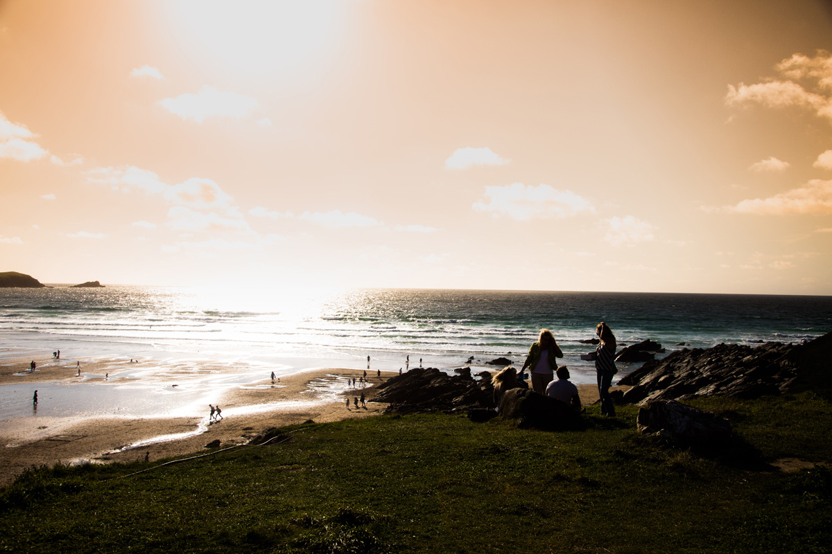
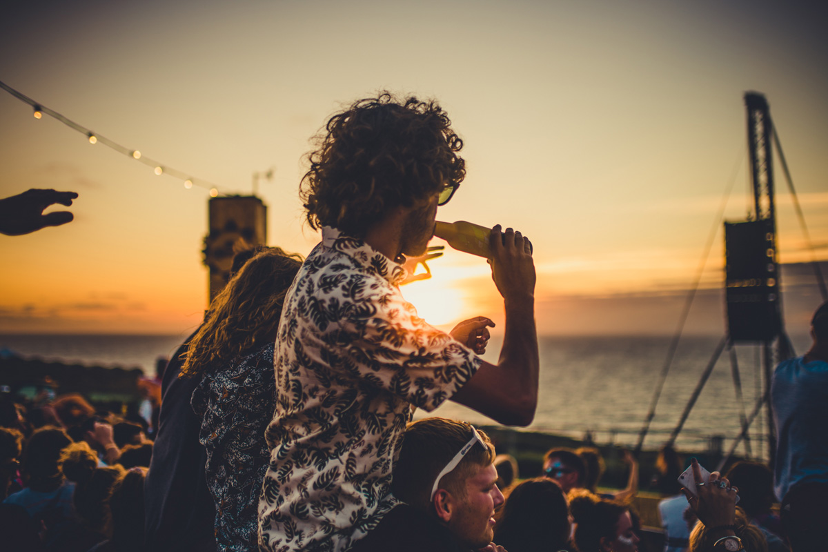
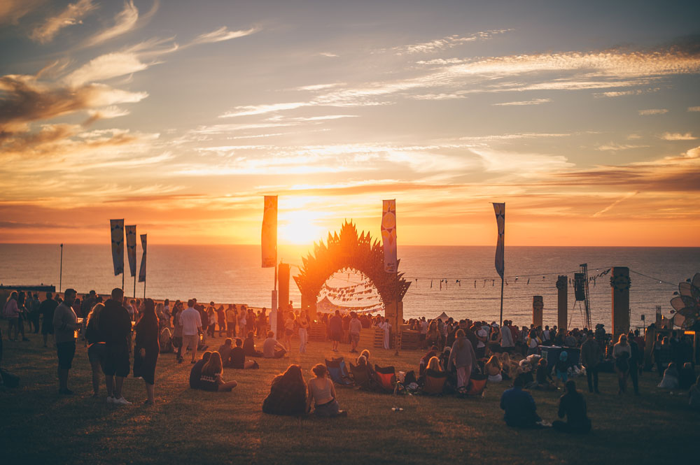
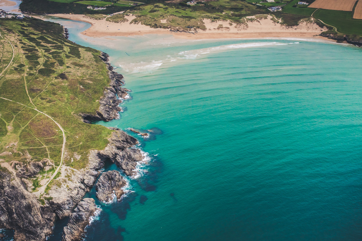
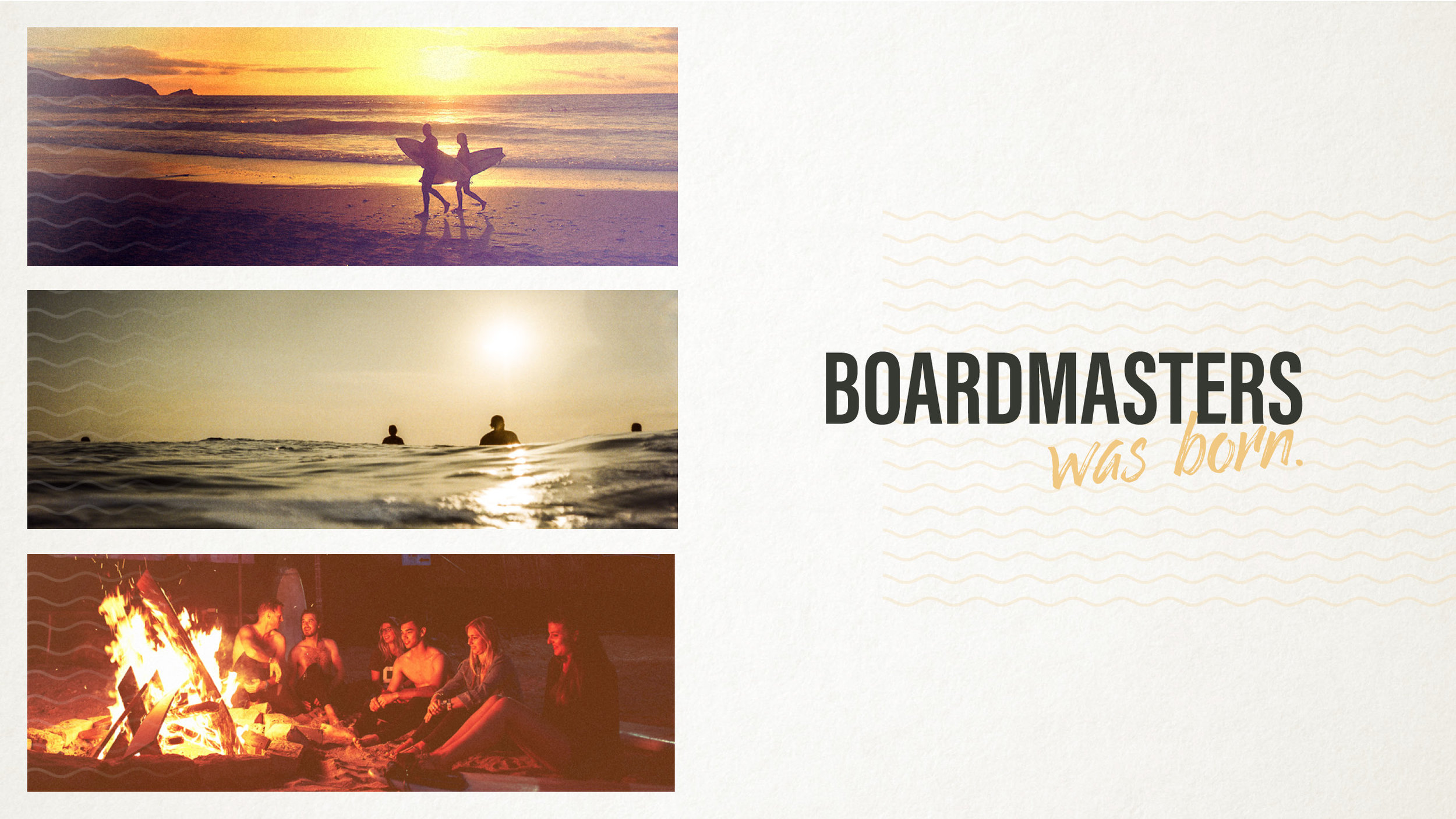
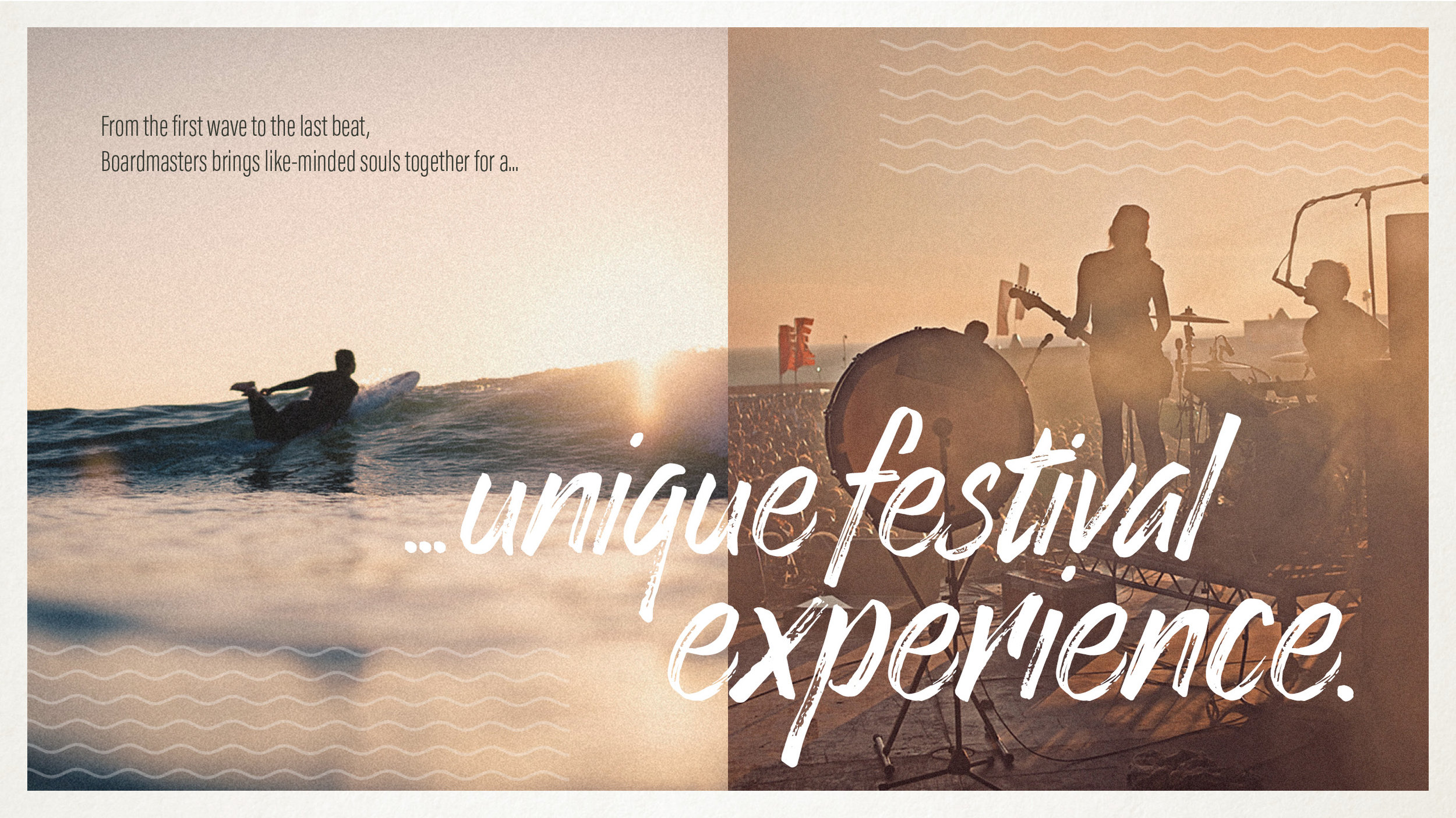
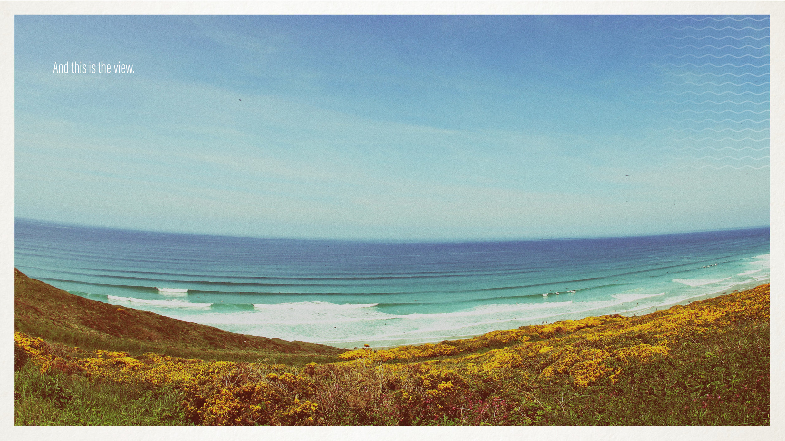
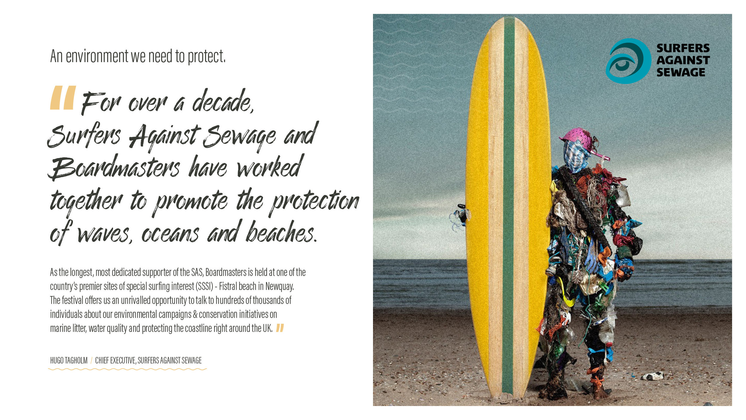
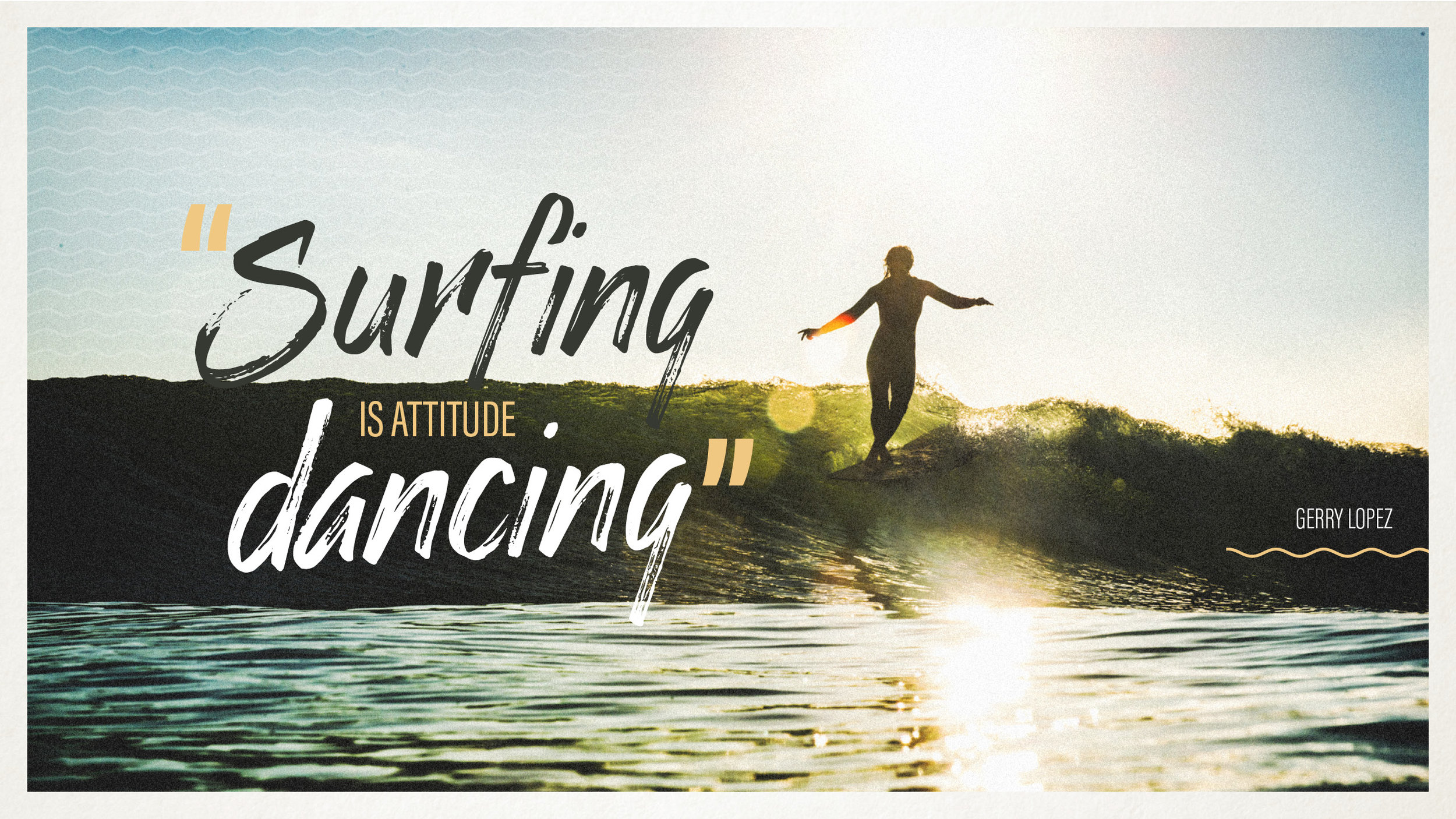
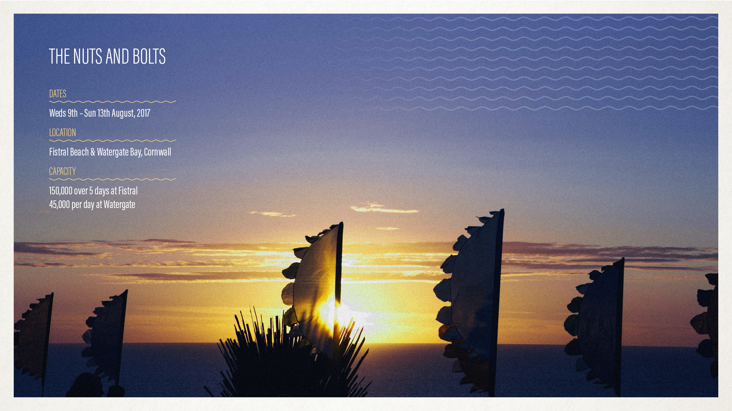
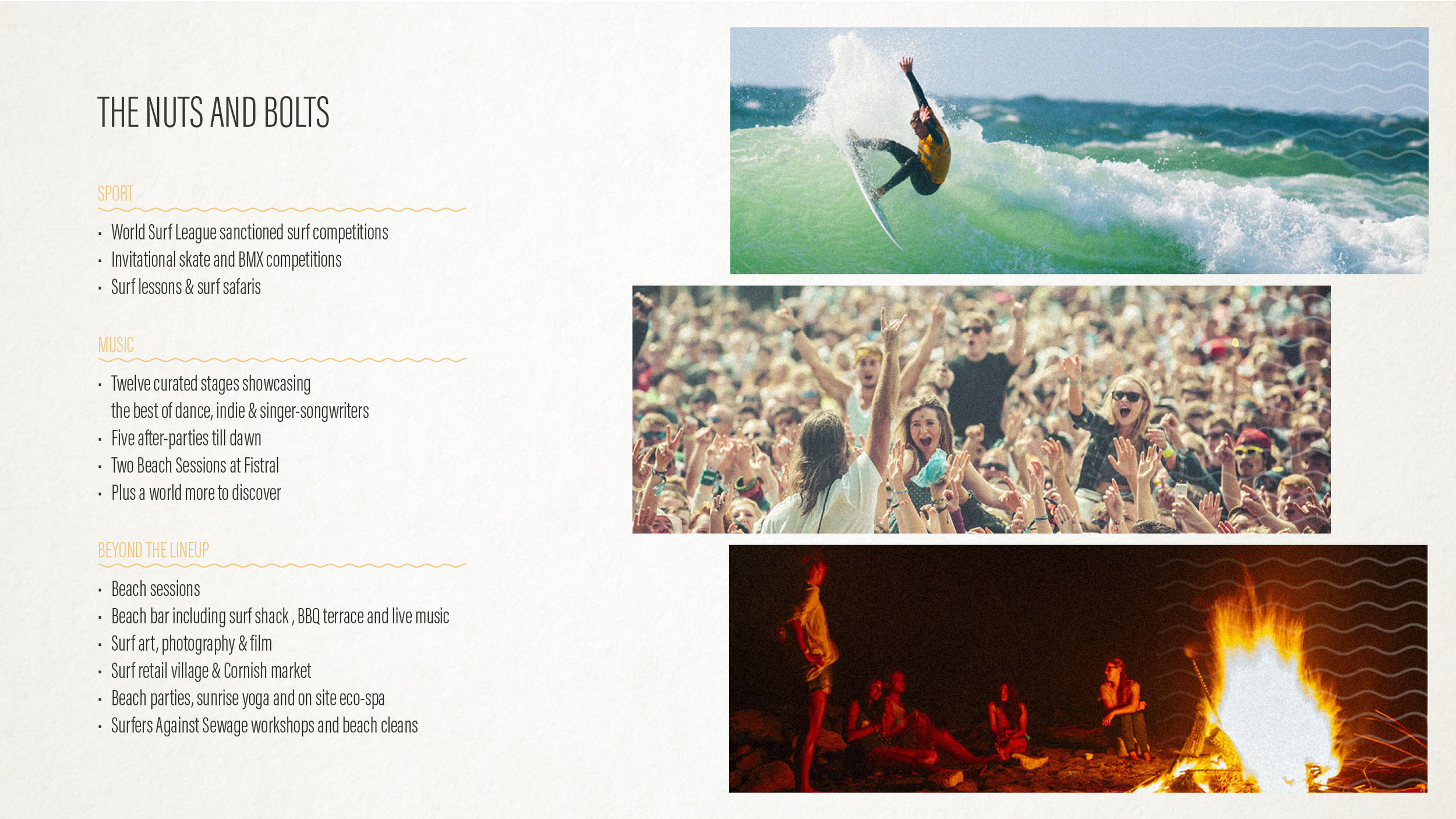
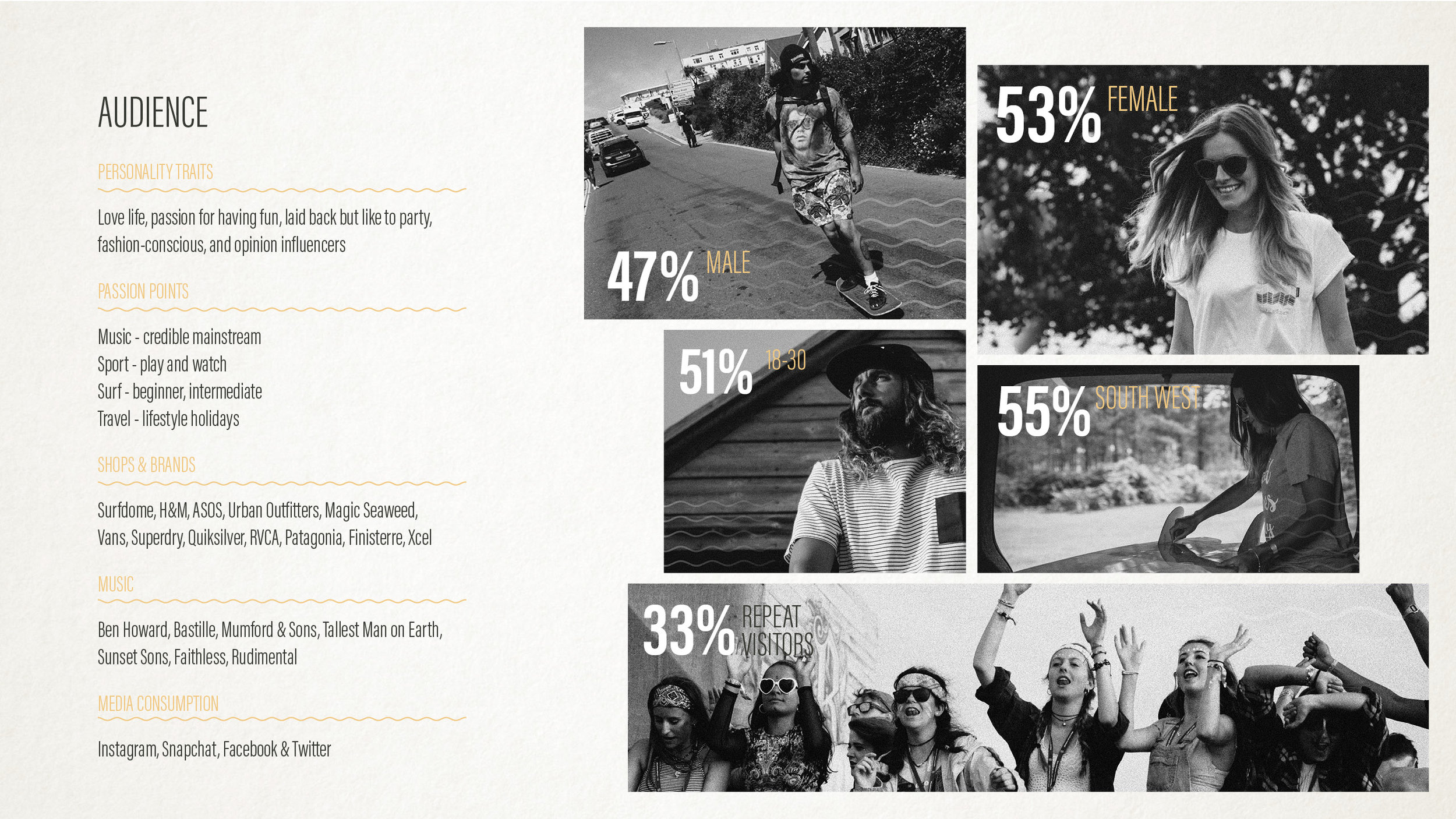
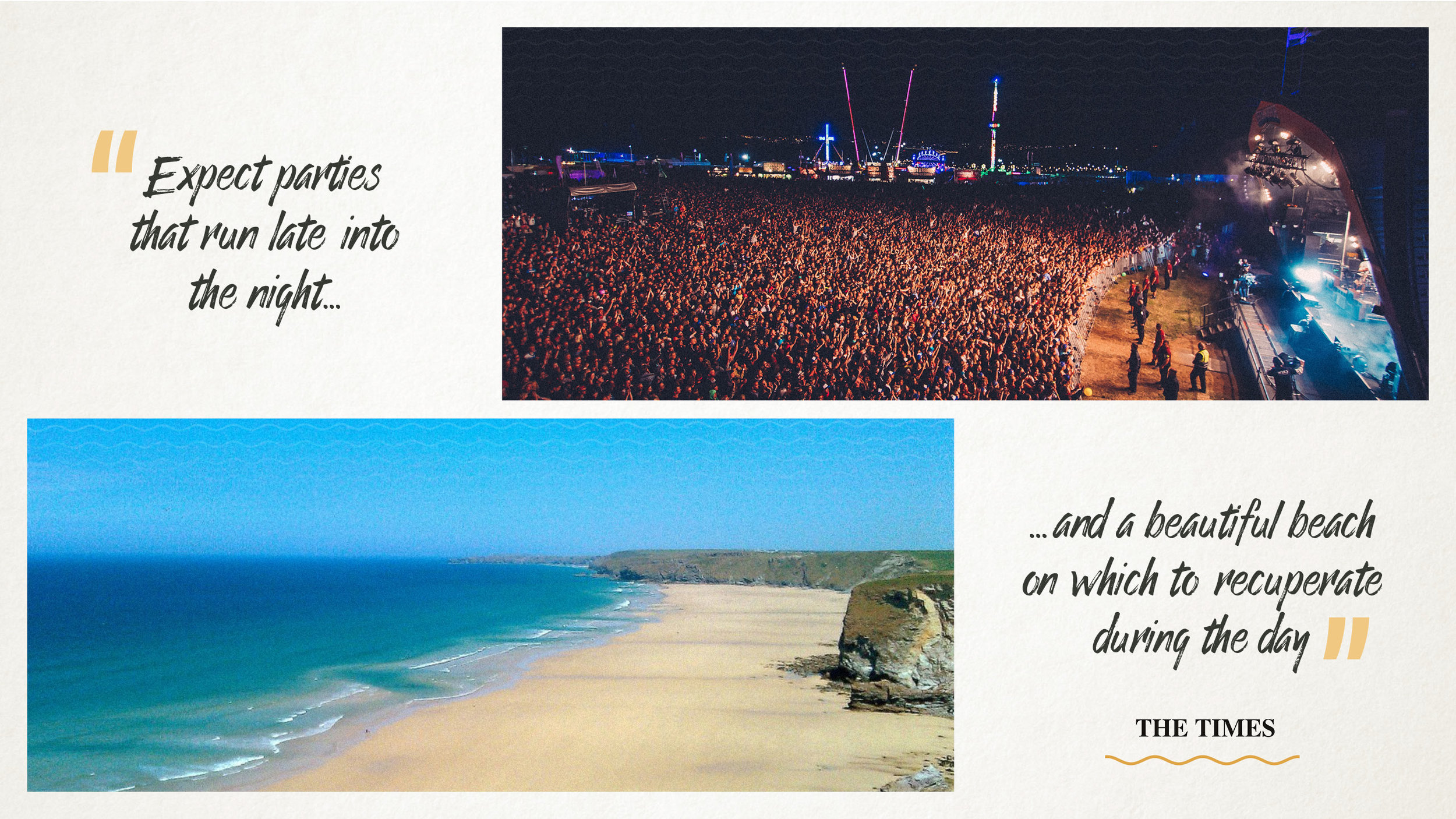
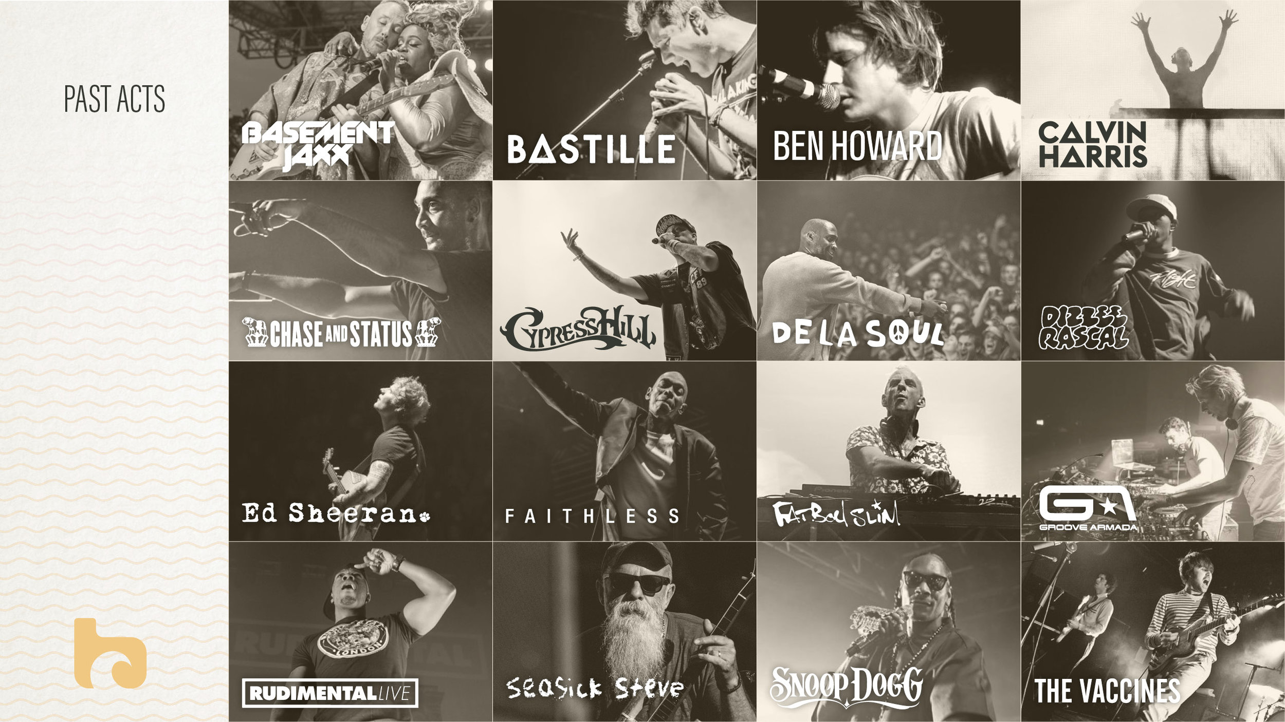
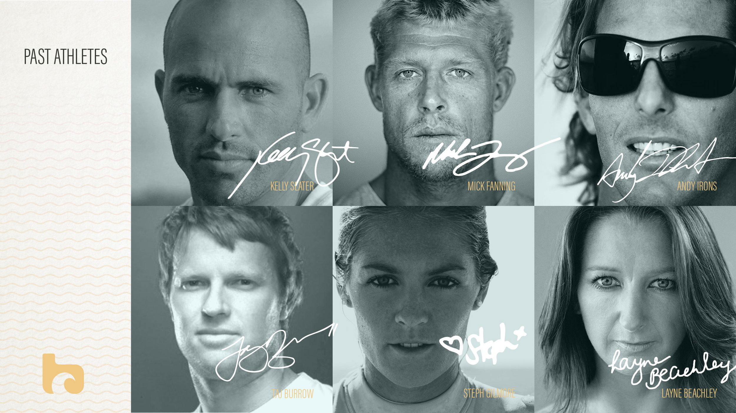
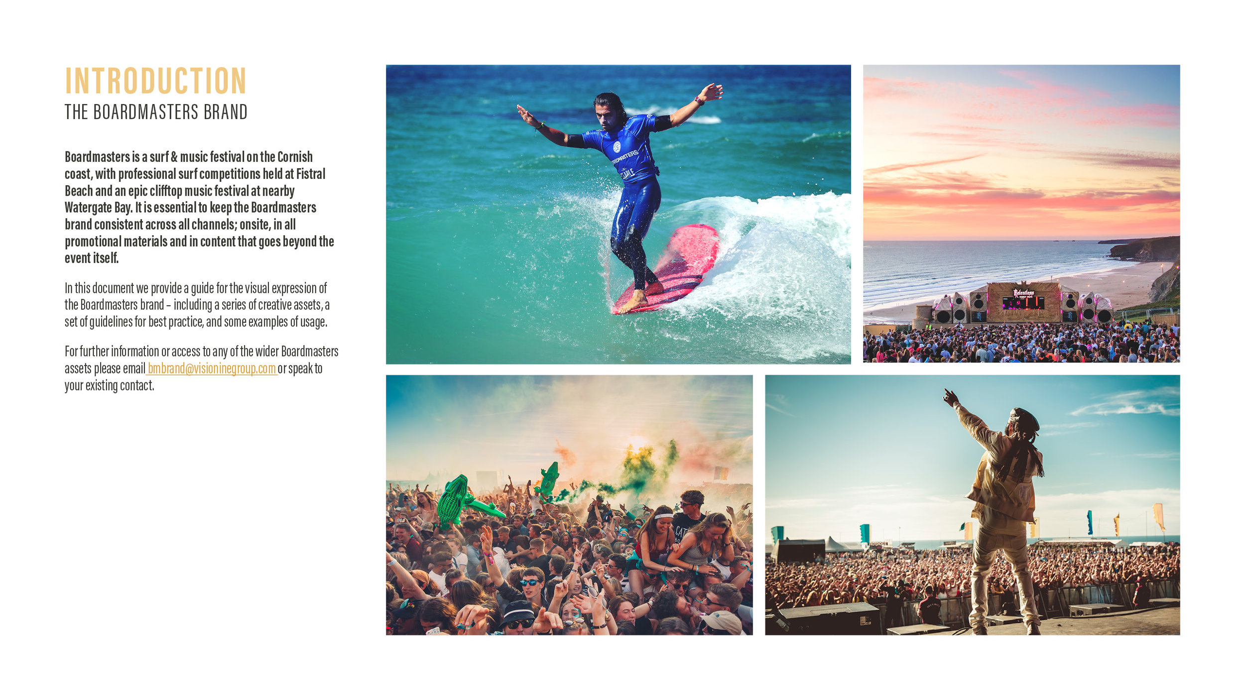
Boardmasters is a surf and music festival spanning two beautiful beachside locations in Cornwall. Each year the overall look and feel is refreshed, but it was decided that the brand itself was in need of a rethink in order to truly represent what the festival was about: capturing the essence of beach lifestyle and celebrating the combination of a unique location, professional surf competition and clifftop music festival.
Role: Creative Director
Design: Vision Nine in-house creative team (Indra Waughray, Callum Chambers)
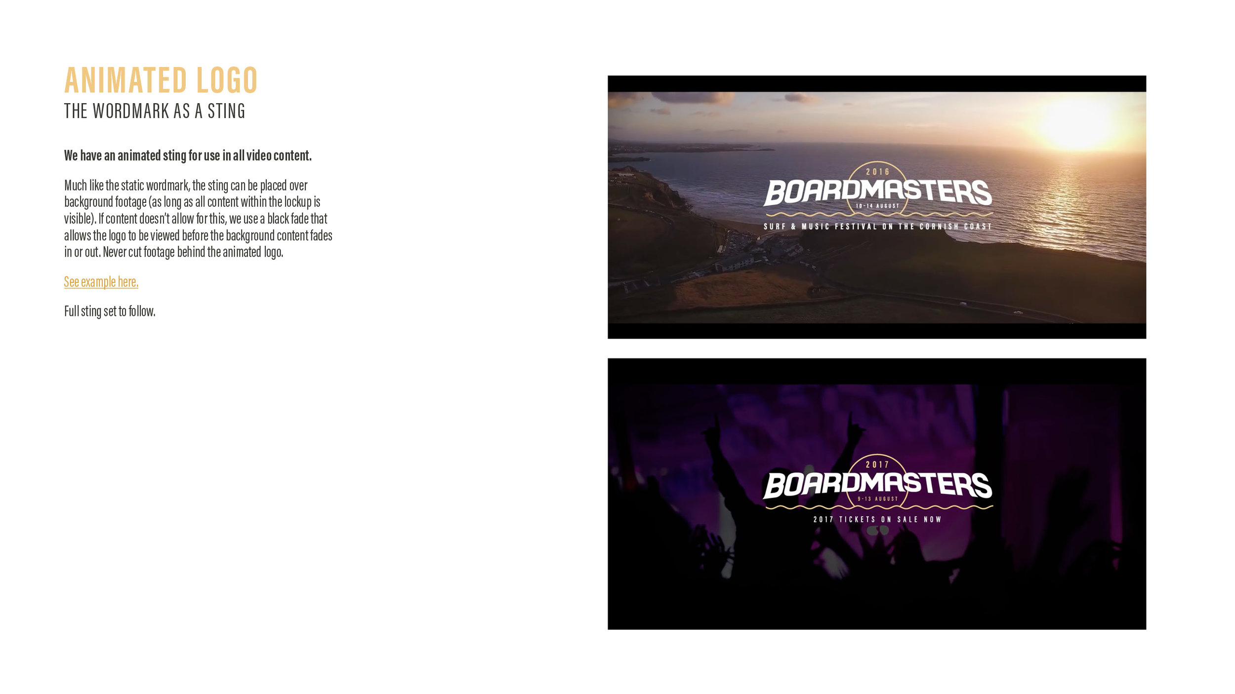
Once the core values of the festival were ascertained, we set about revisiting the visual assets, from logo wordmark (static and animated), iconography, palette, fonts and photography.
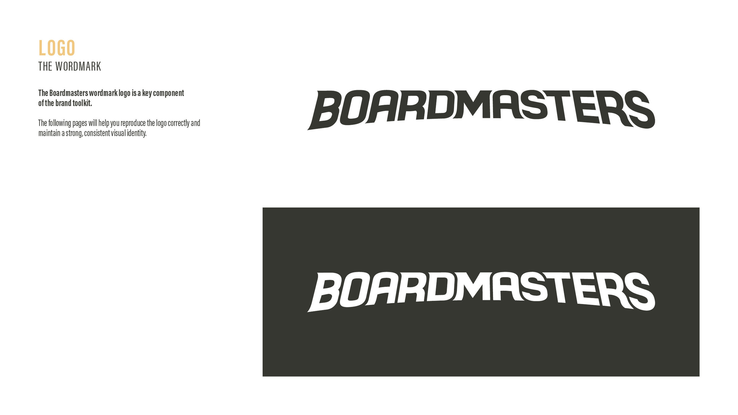
The Wordmark
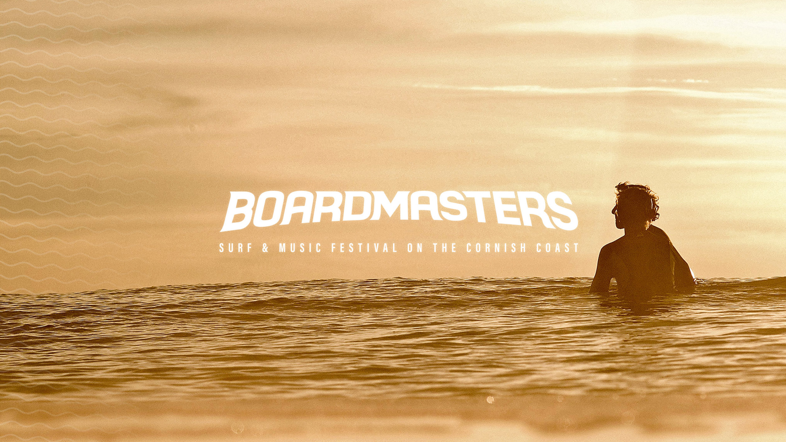
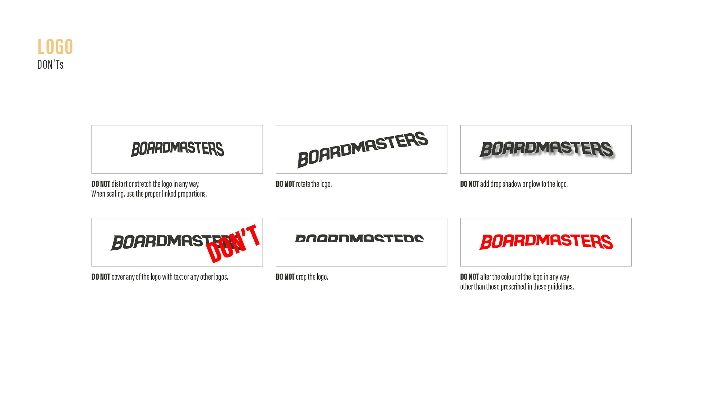
Due to brand recognition, it was decided we needed to modernise the logo rather than reinvent it. We took the existing wordmark and stripped it right back to the font that it was originally made from. From there we rebuilt it, aiming for a simpler, calmer and more modern look, incorporating wave elements running through the design.
Existing wordmark was stripped back and then rebuilt
New wordmark
The B Icon
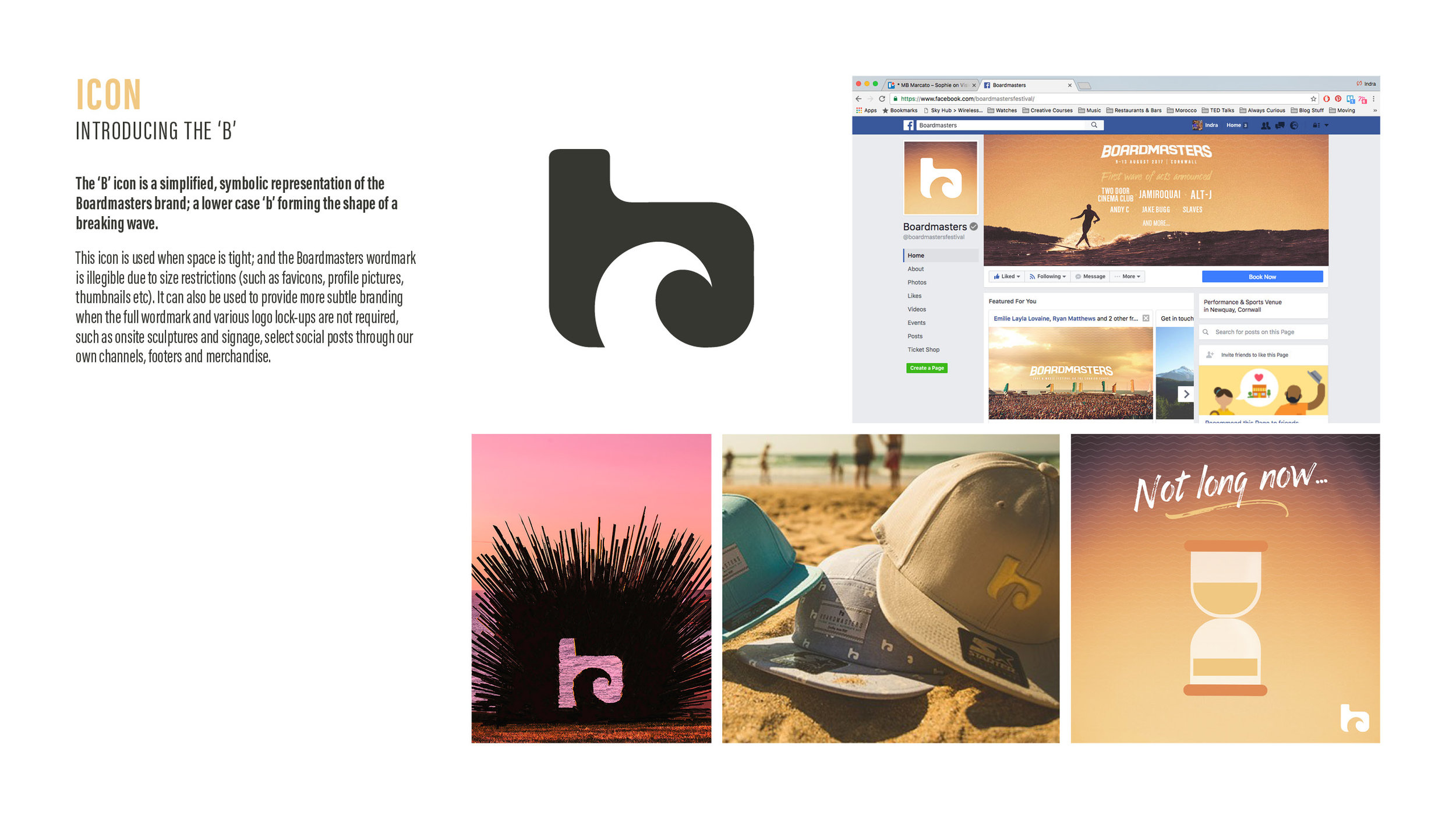
Due to the format of the wordmark, we were in need of brand representation that worked at smaller sizes, so we recreated the existing 'B' icon, making it smoother, tidier and injecting the wave itself with more energy.
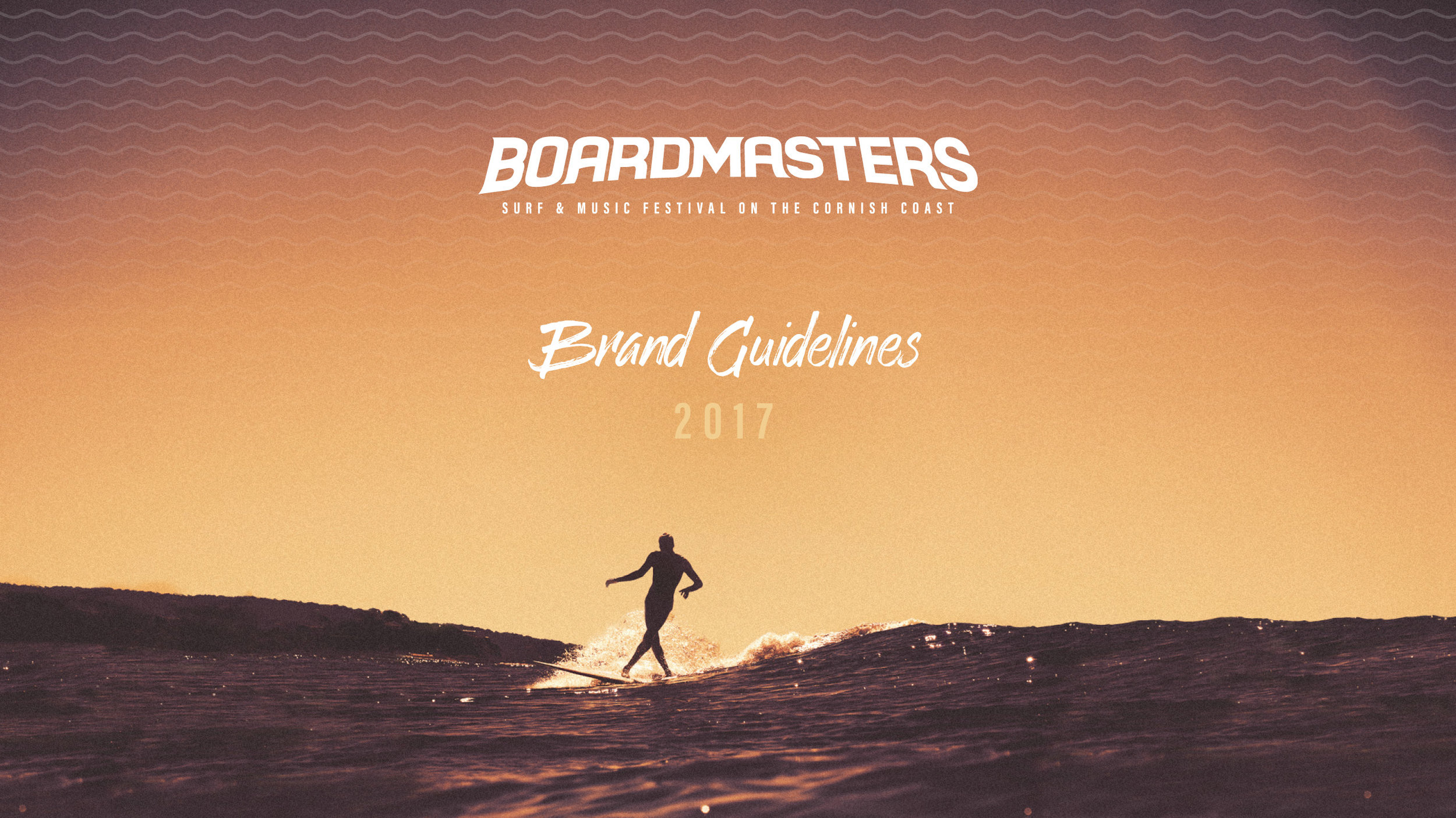
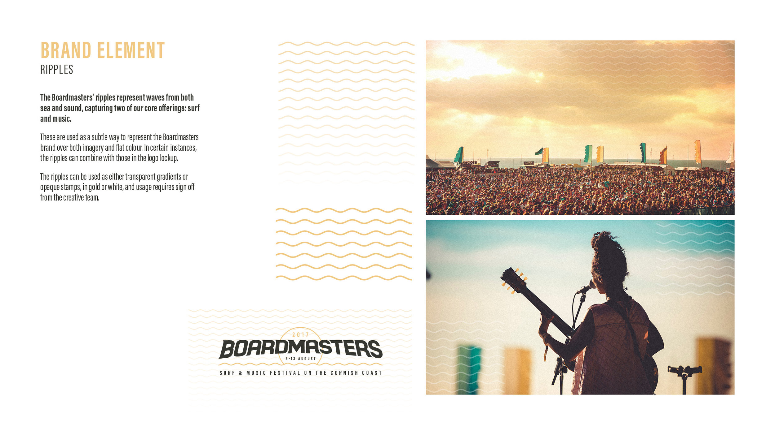
Alongside the logo and icon refresh, a 'wave' element was created as a supporting device to represent not only waves from the ocean, but also sound waves from live music. This is used throughout the brand assets to add consistency to imagery as well as a typographic divider.
Typography
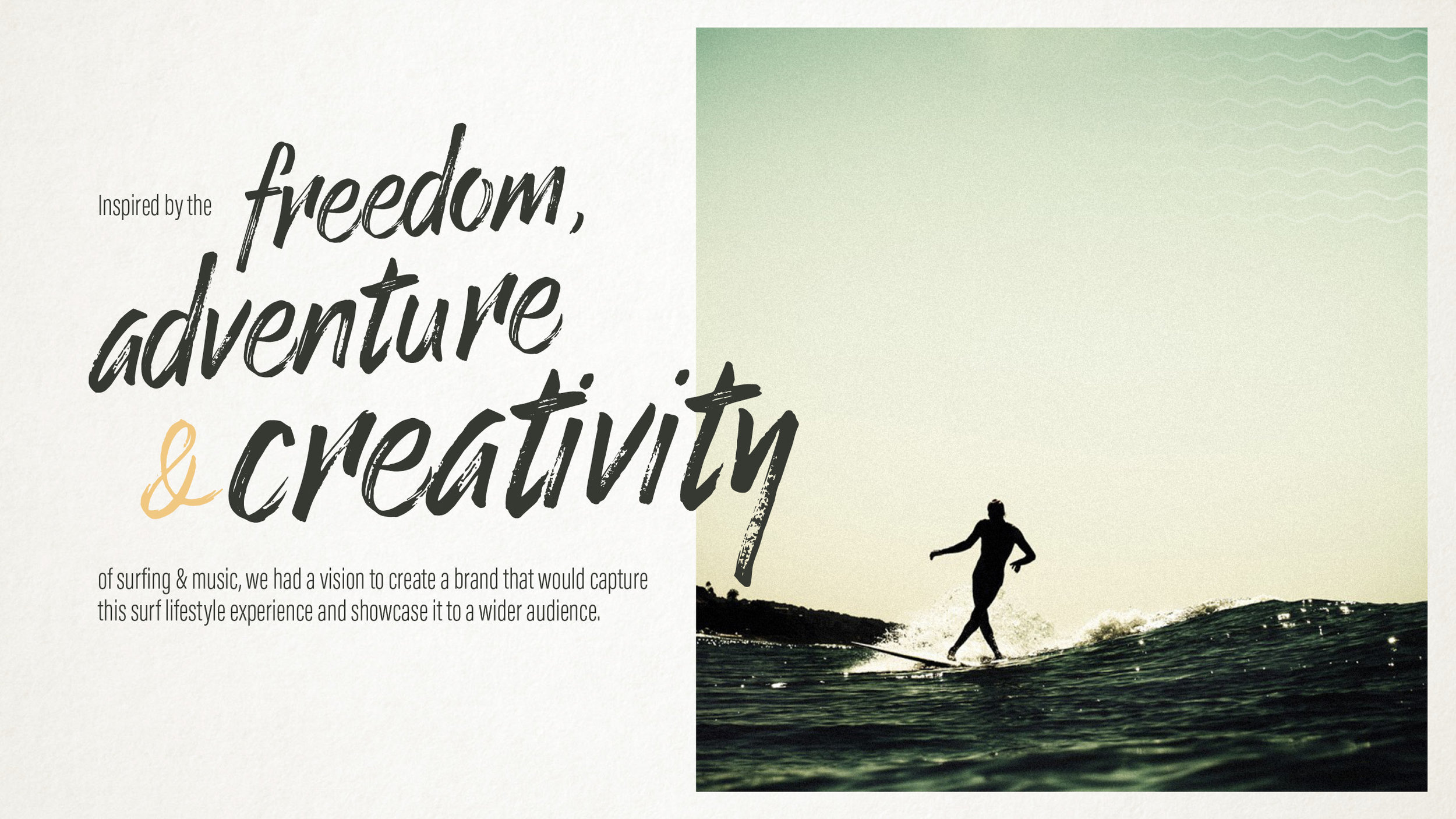
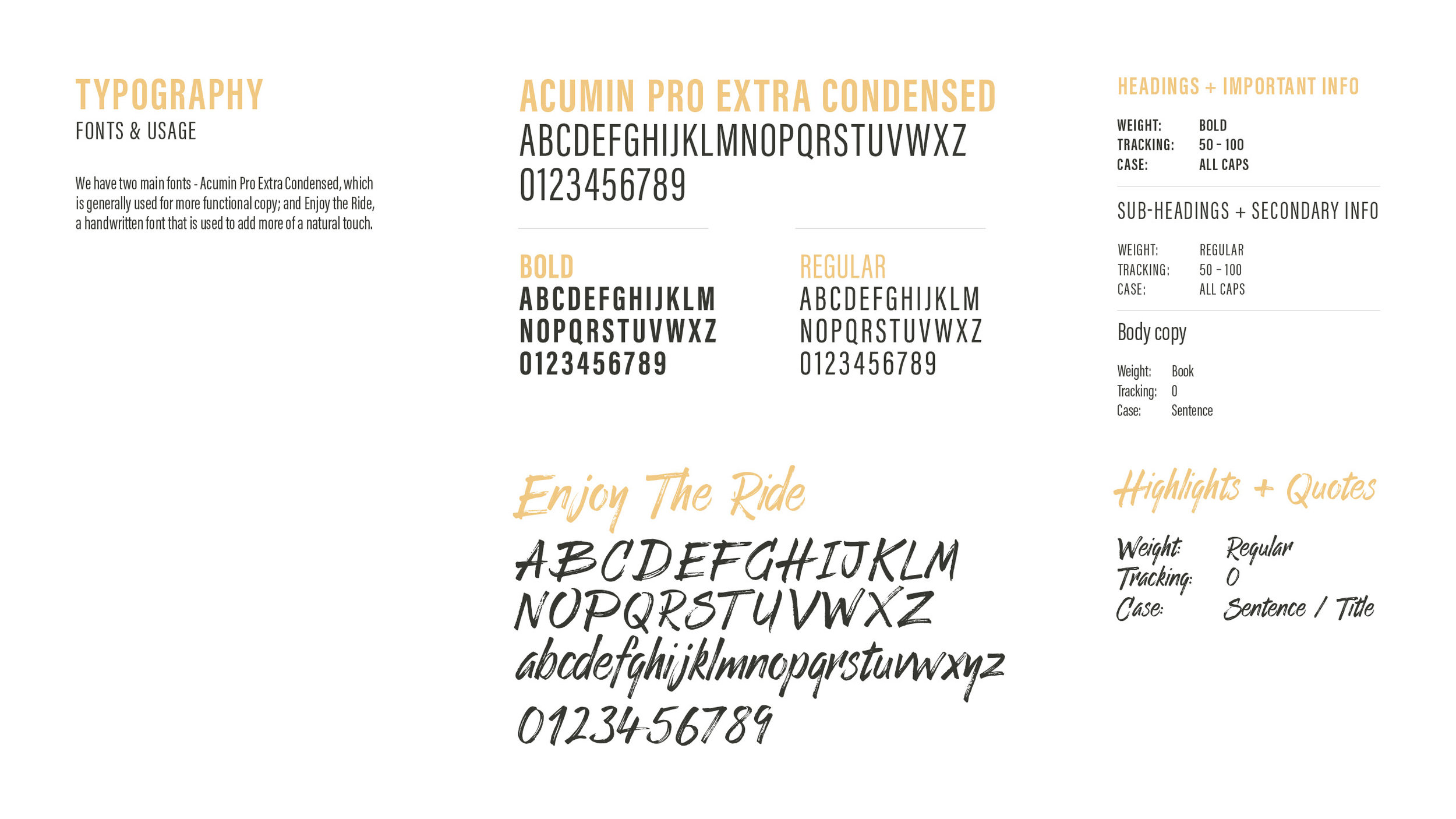
The previous use of Trade Gothic alongside a handwritten supporting font worked, but we updated the main font to the more playful Acumin Pro Extra Condensed and Enjoy the Ride, a less frenetic handwritten font with an artistic flourish that allows for more typographic choice at a larger size.
Typography references
Typography references
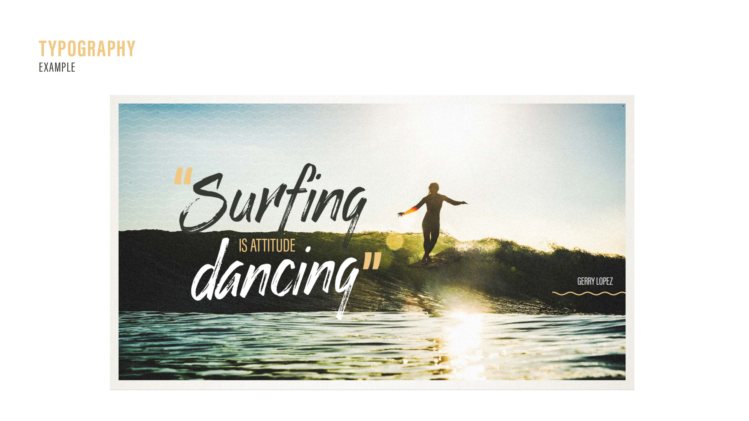
Acumin Extra Condensed, Enjoy the Ride, photographic texture and ripple element in use.
Colour Palette
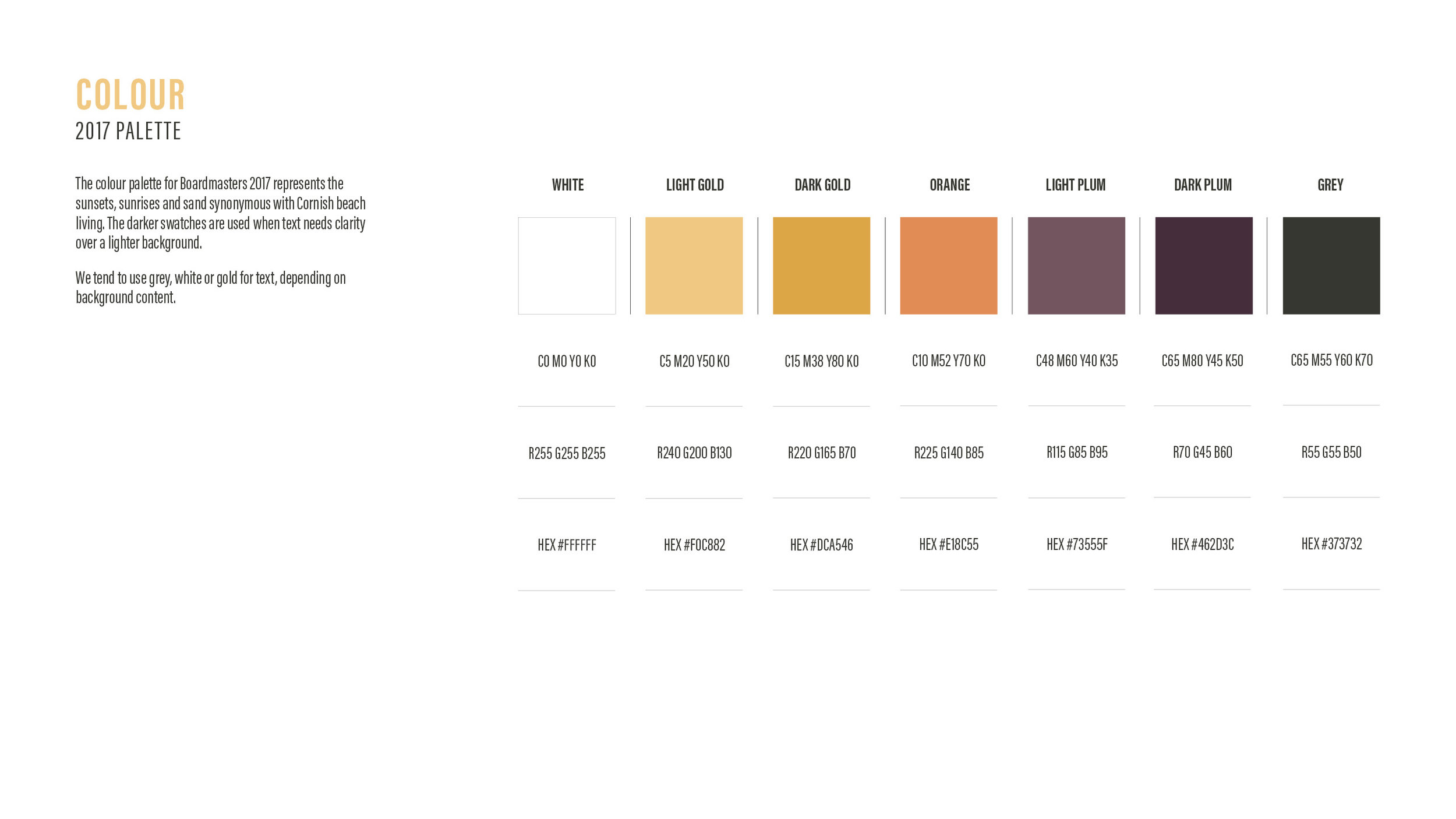
We created an overarching palette of off-white, grey and gold, which allows year specific palettes to adapt whilst still combining as a complimentary palette. Likewise for spin-off brand projects, the core Boardmasters palette remains. The rule for any colour in the flexible palette is that it has to be a natural colour, taking inspiration from the sand, sea, rock or foliage of the relevant environment.
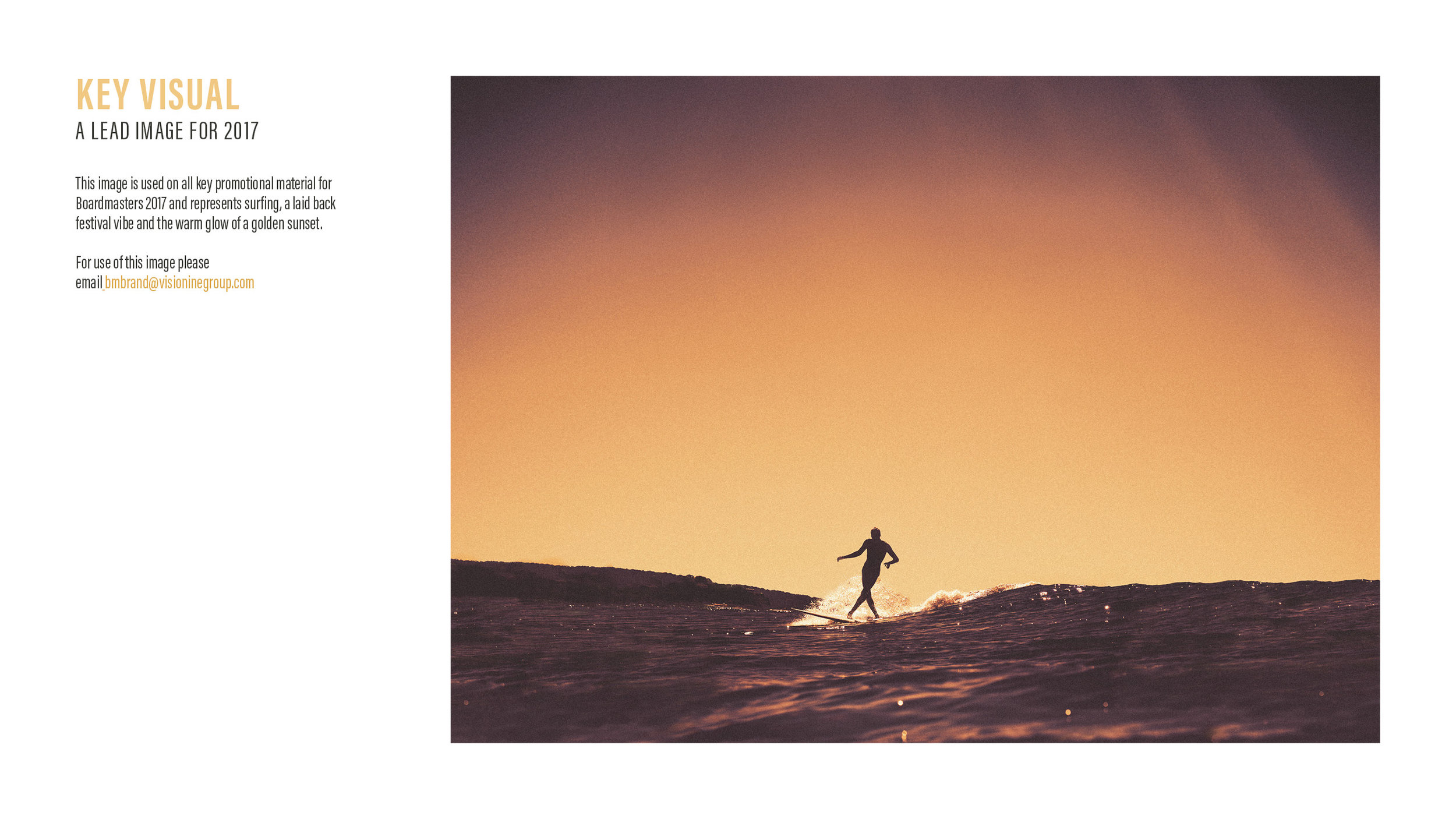
The original 2016 colour palette was taken from Boardmasters' beaches, with turquoise representing the sky and sea, gold the sun and sand, and grey the local Cornish rocks. 2017's palette focussed on the gold Cornish sunset, giving a more chilled out vibe.
Palette for 2017
Imagery
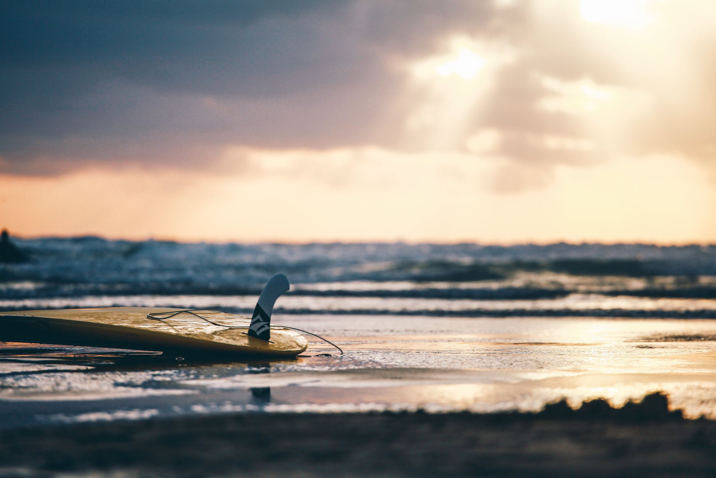
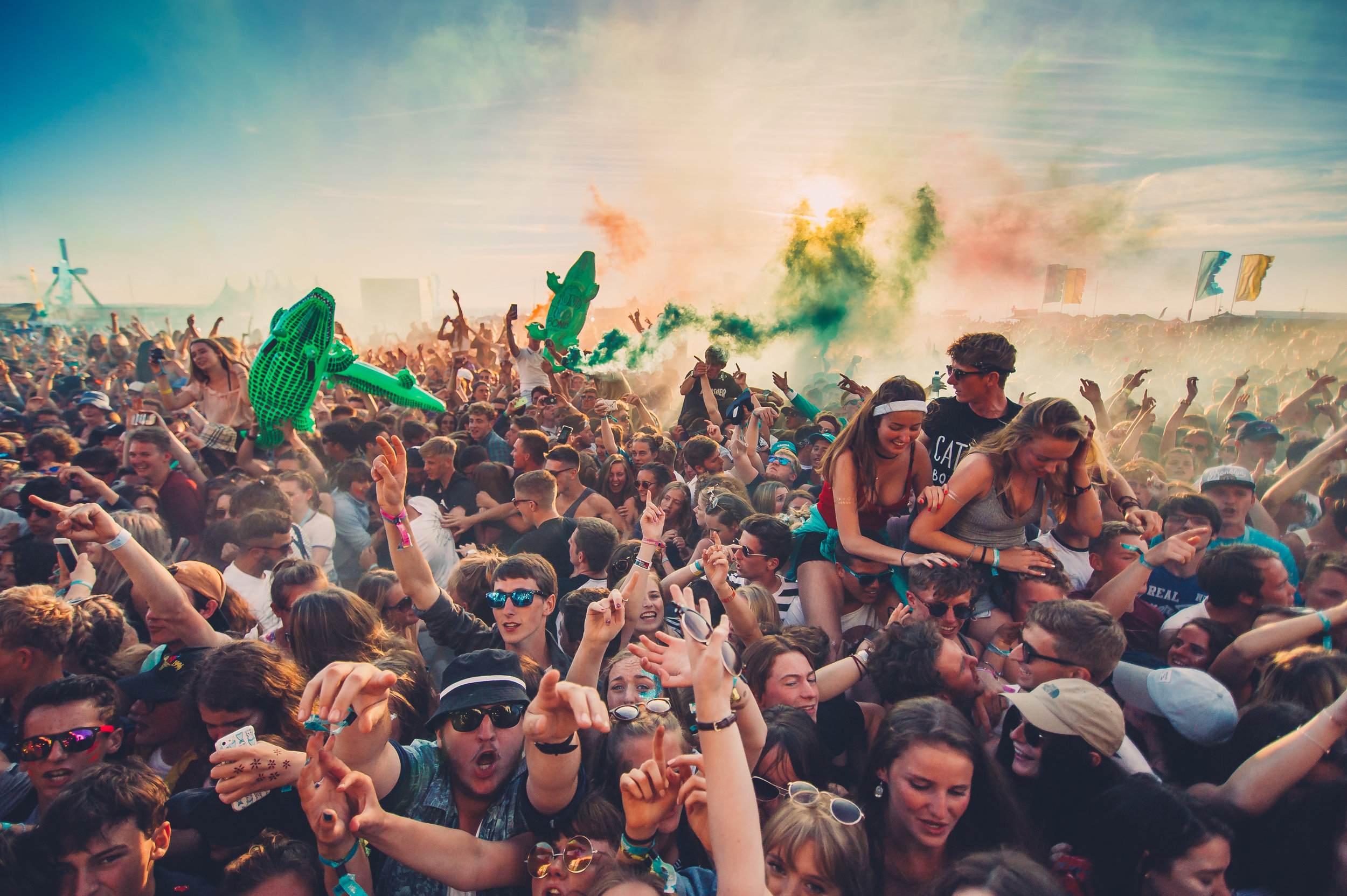
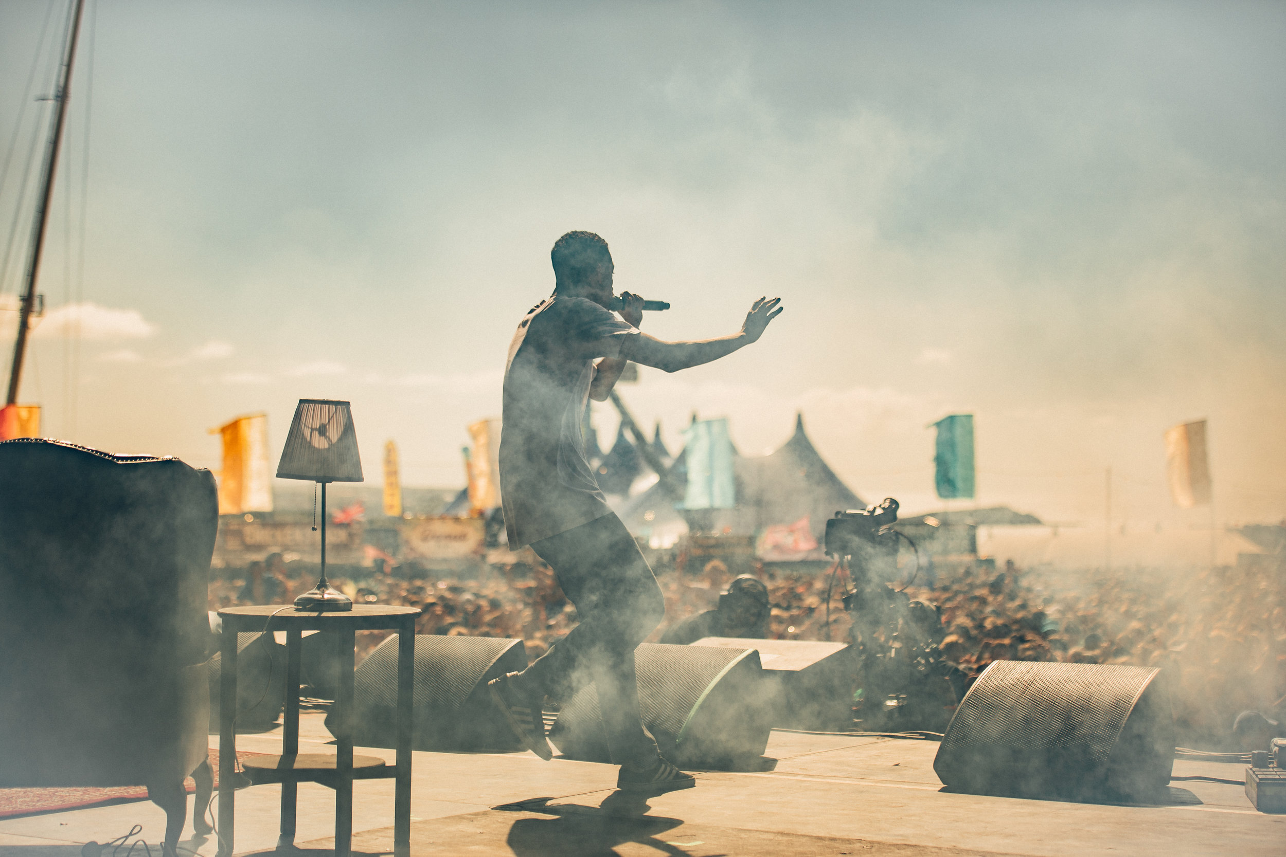
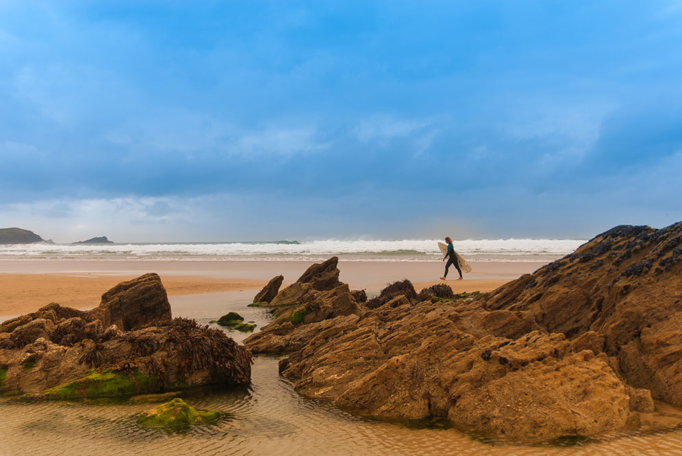
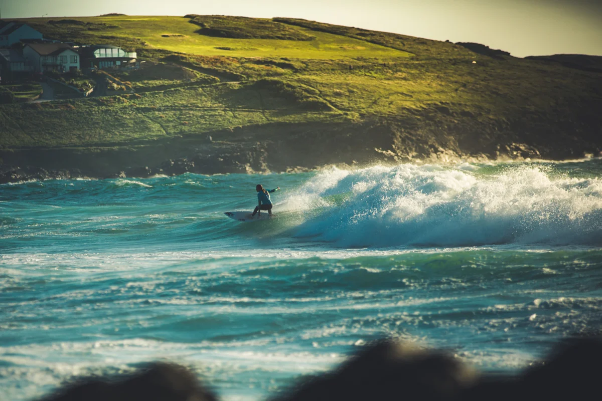
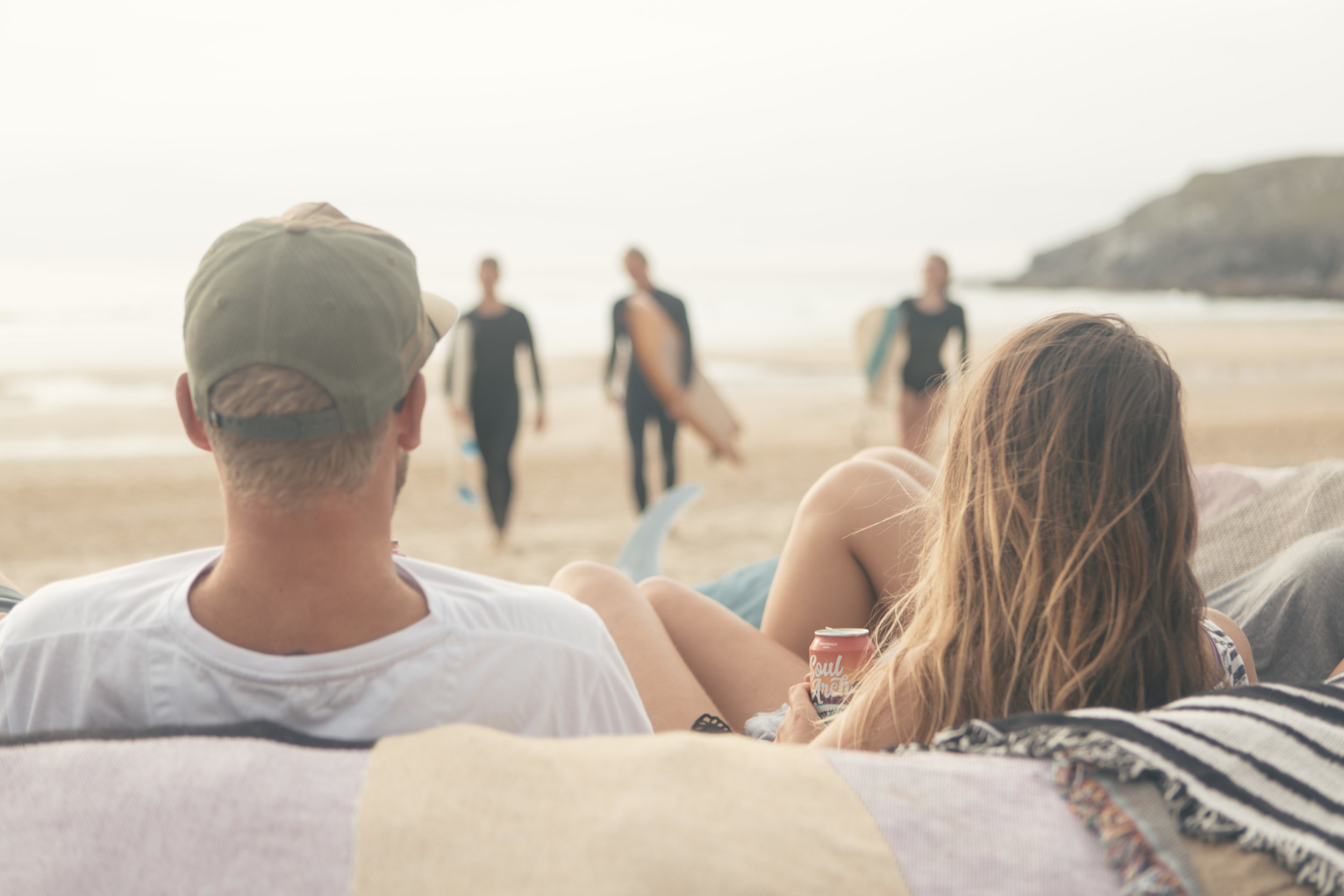
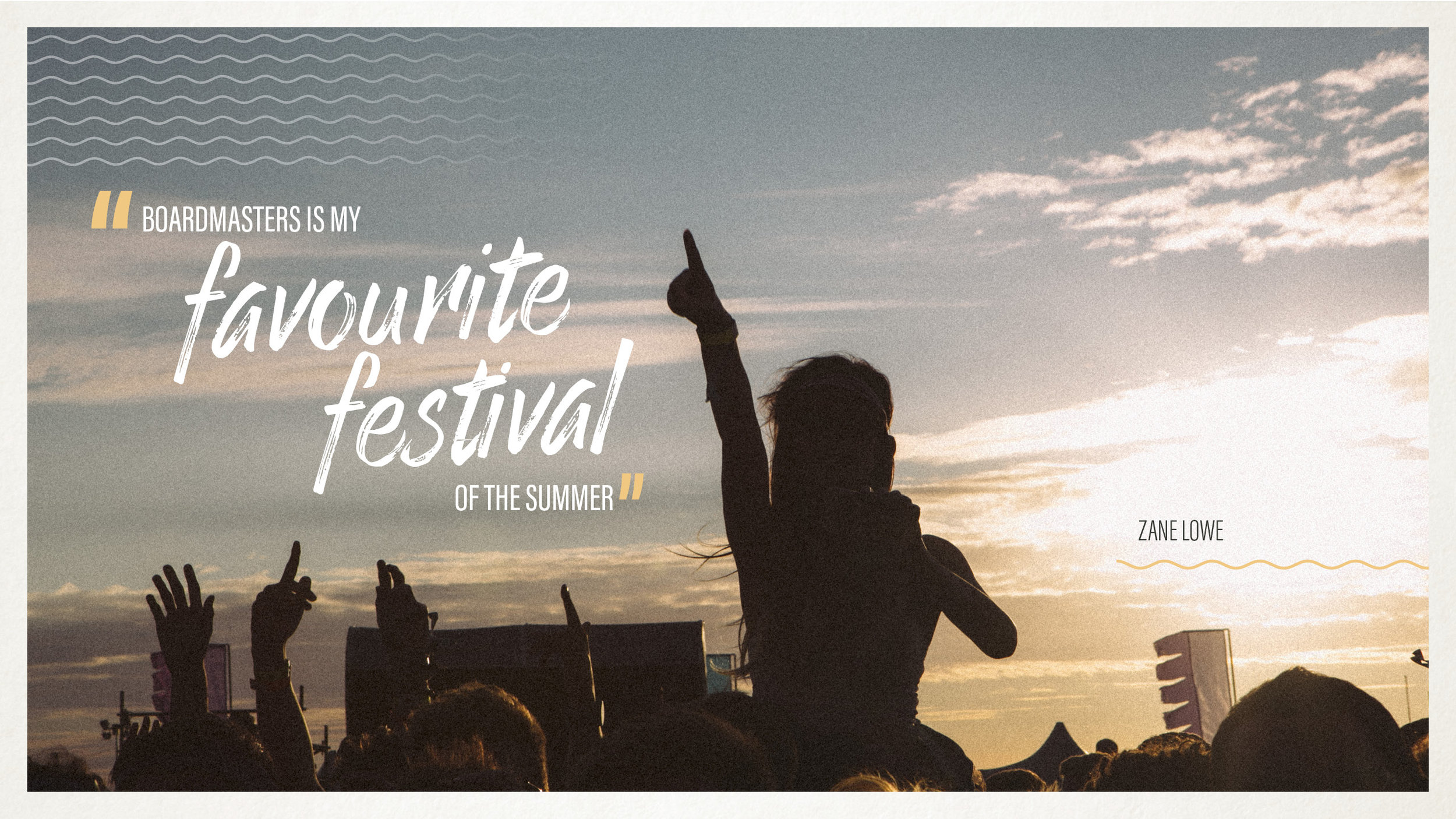
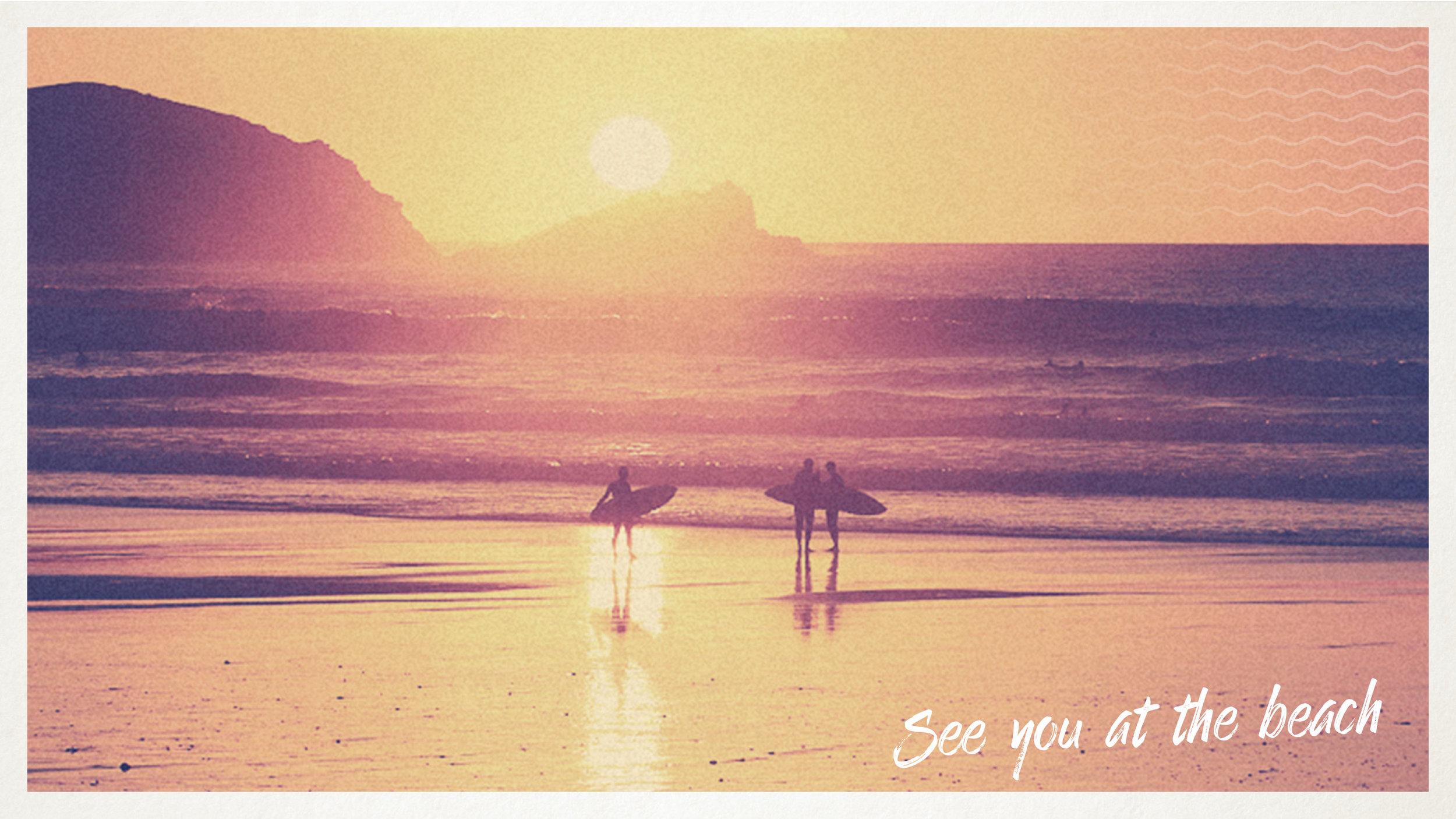
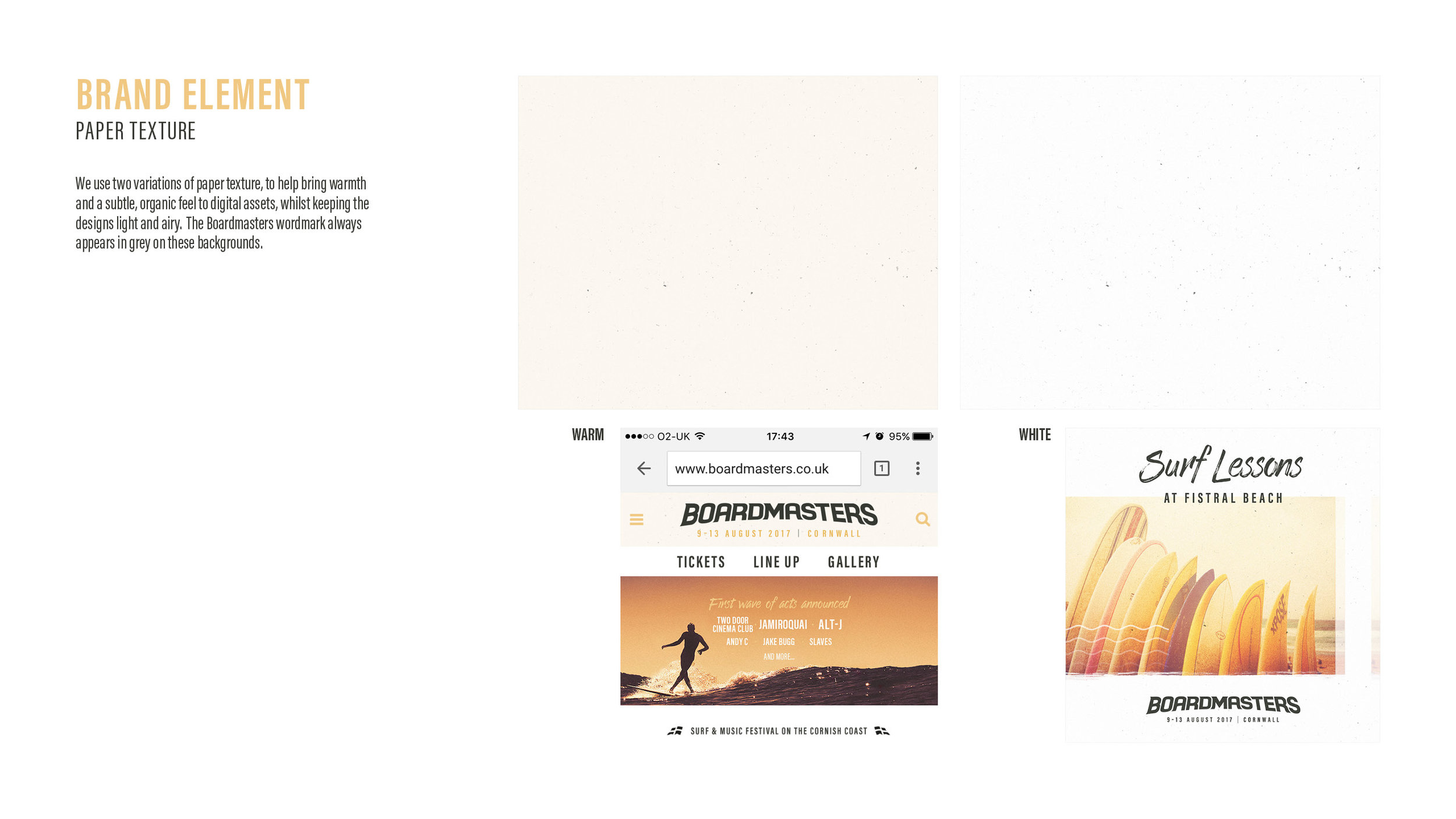
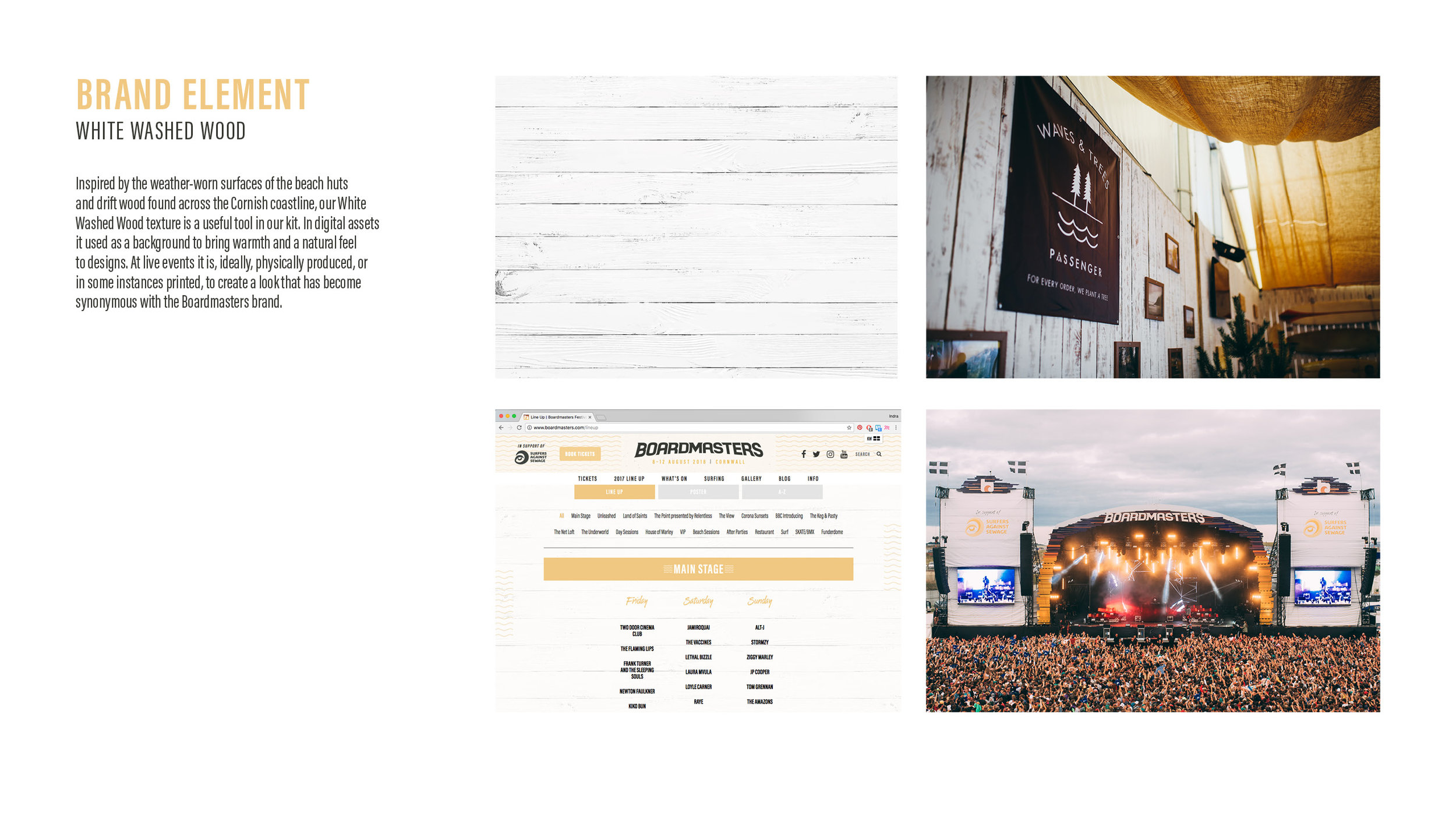
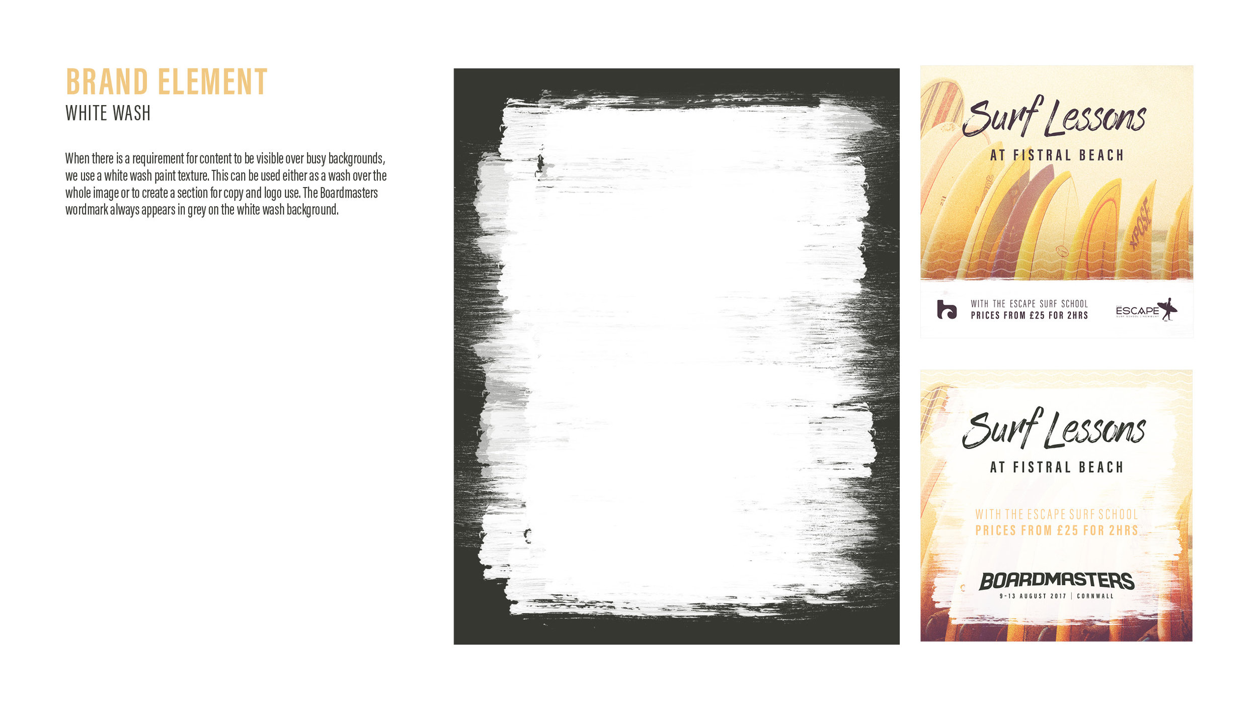
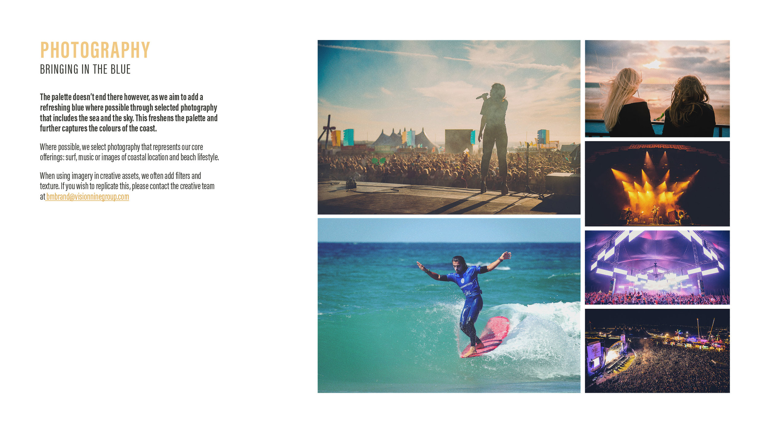
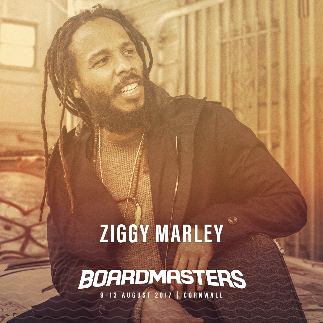
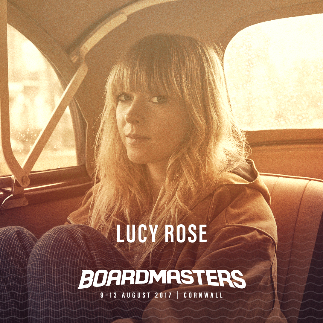
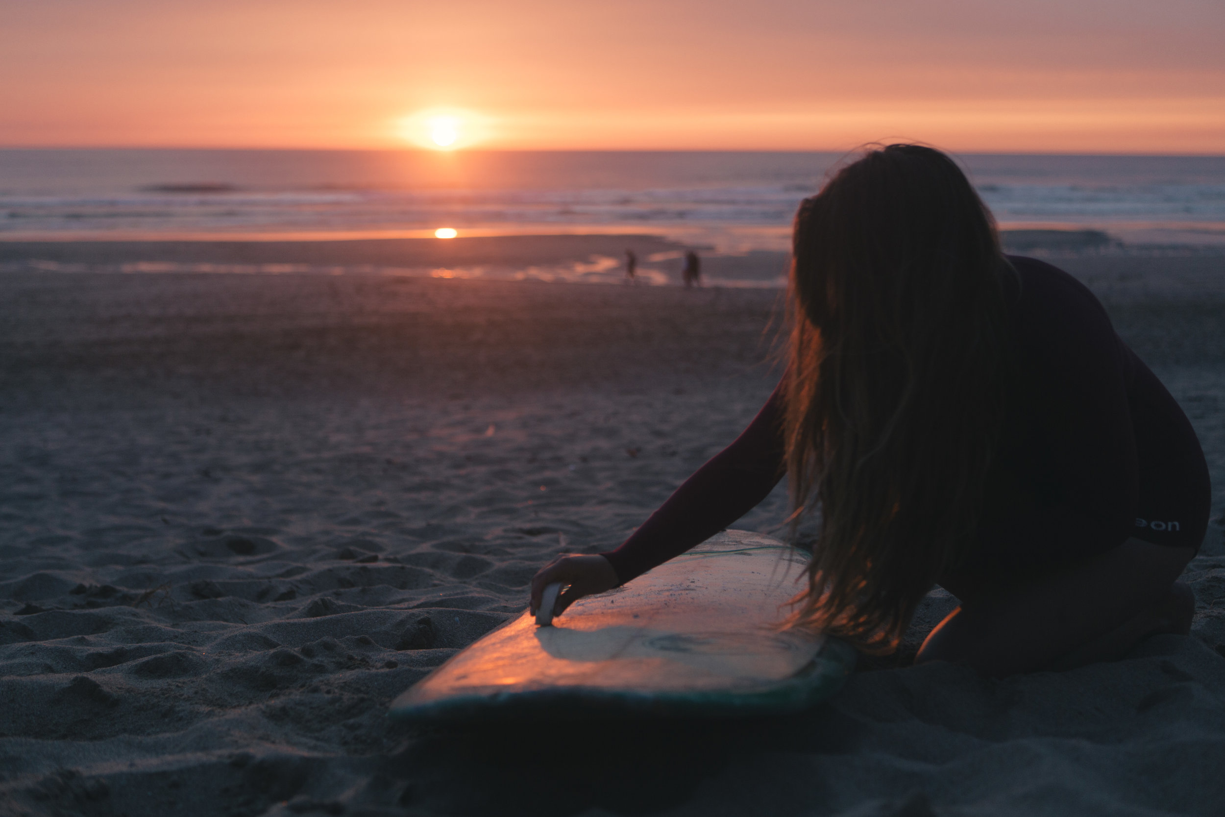
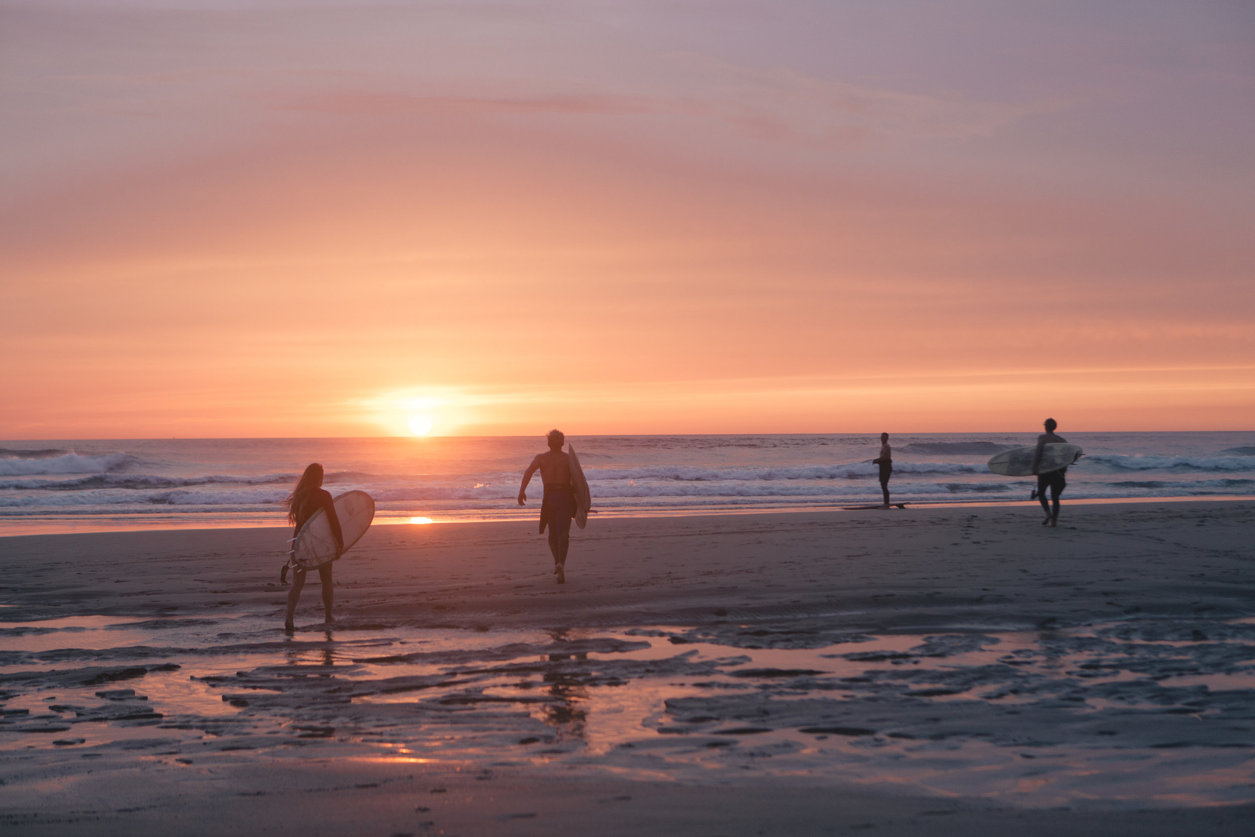
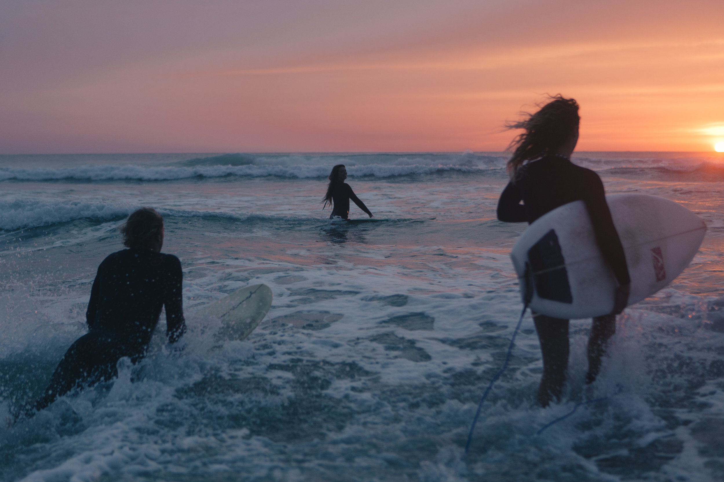
Brand imagery was created or sourced that captured the essence of Boardmasters. Further imagery was filtered and brand elements were added where relevant to give it a consistency.
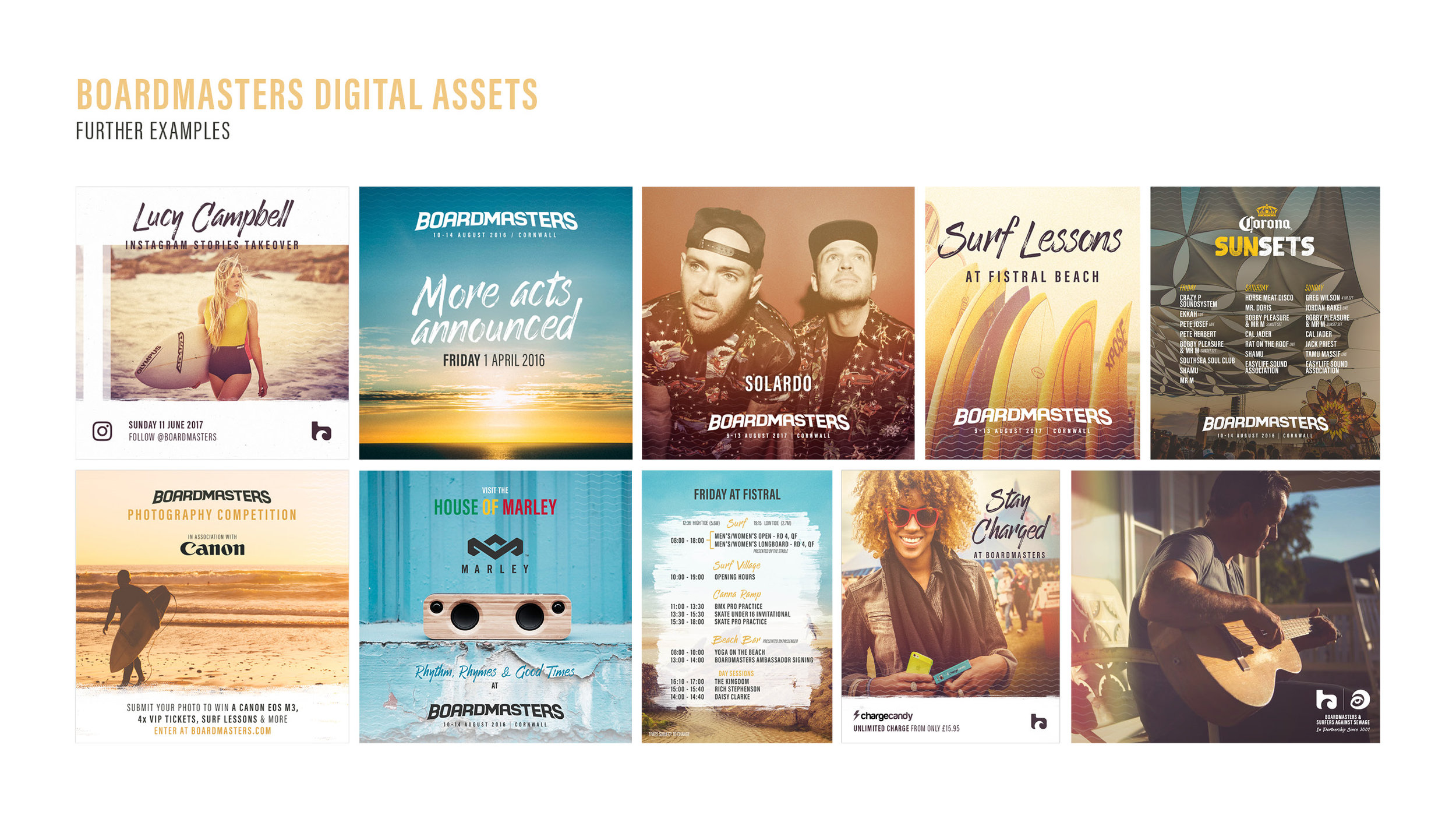
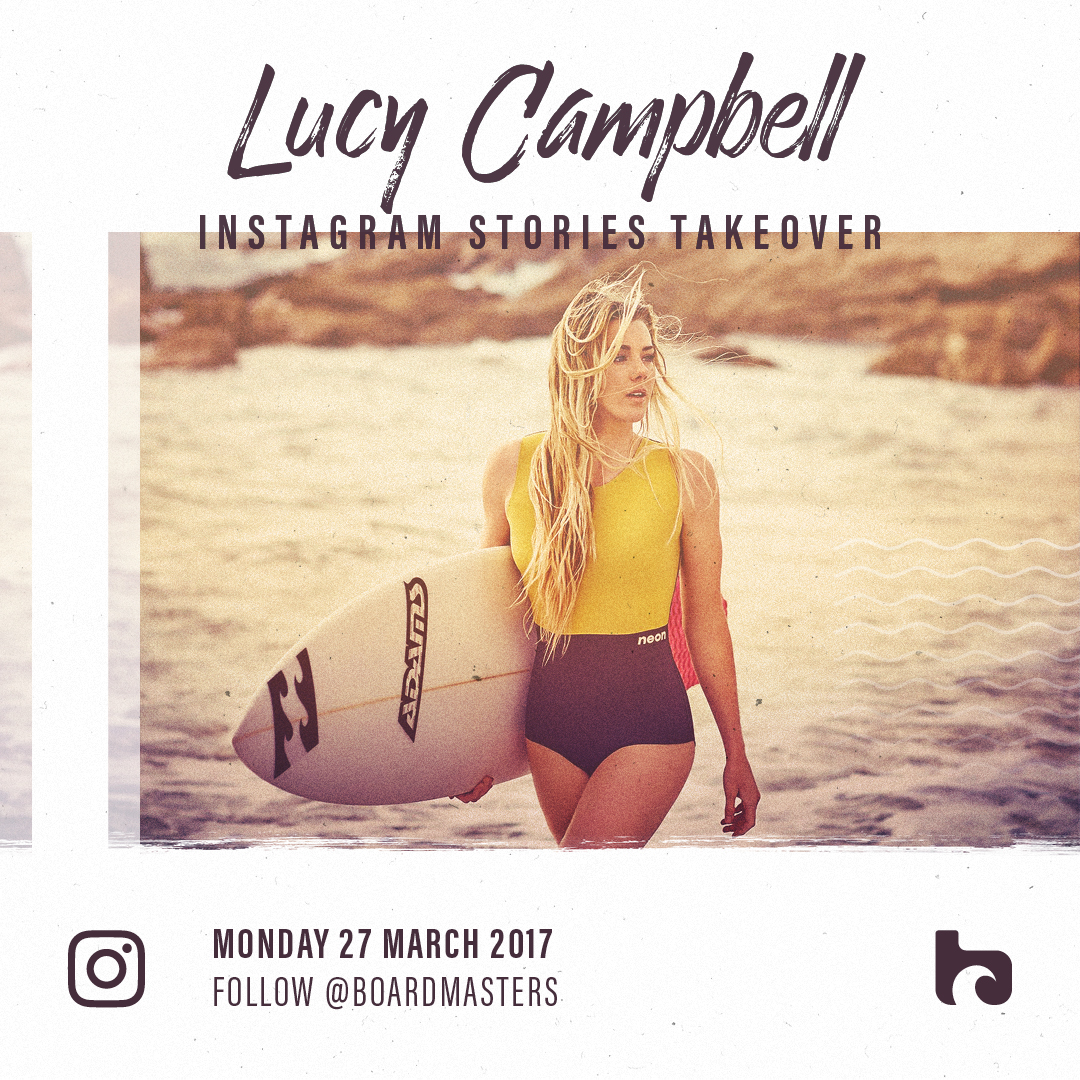
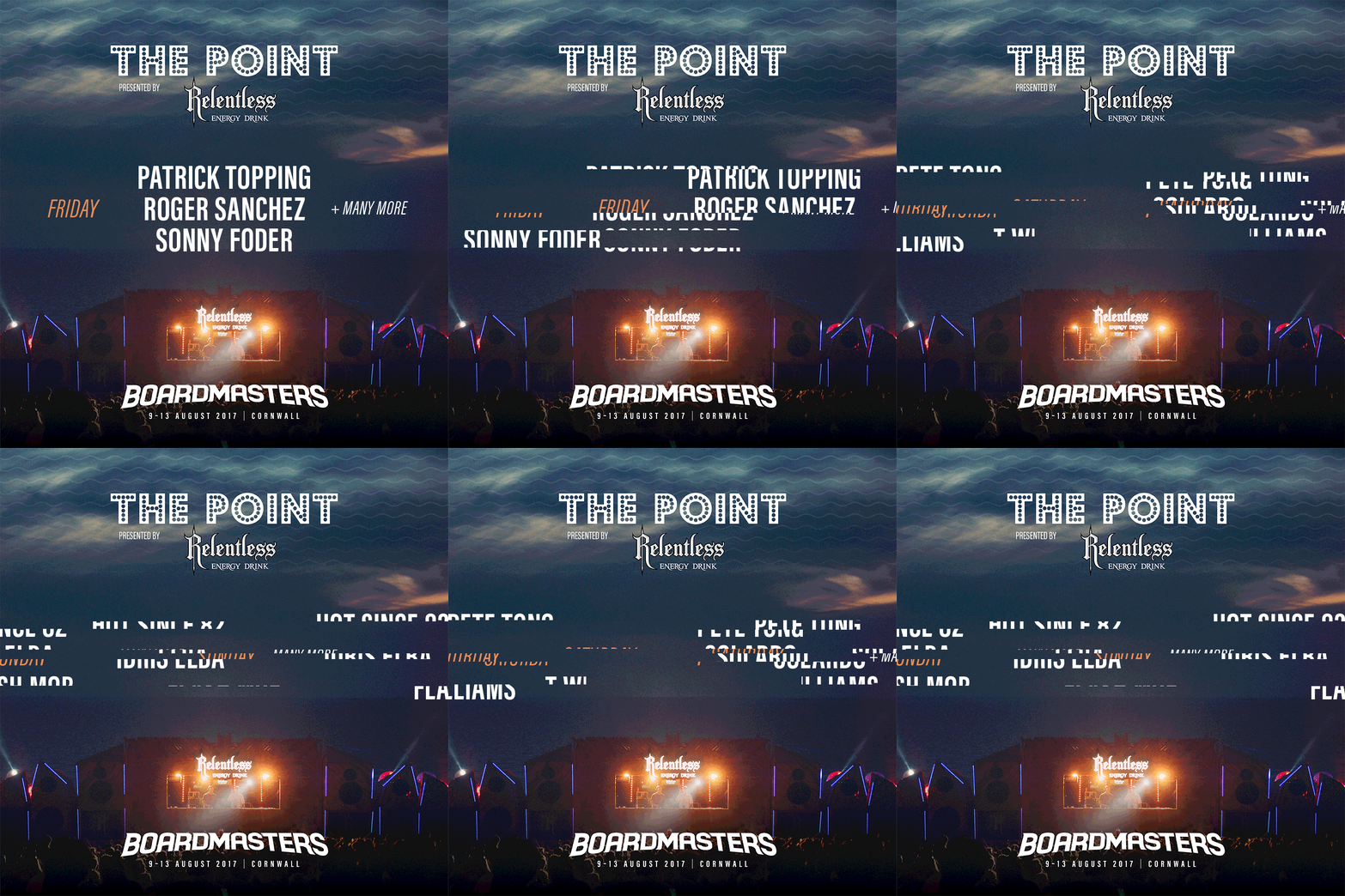
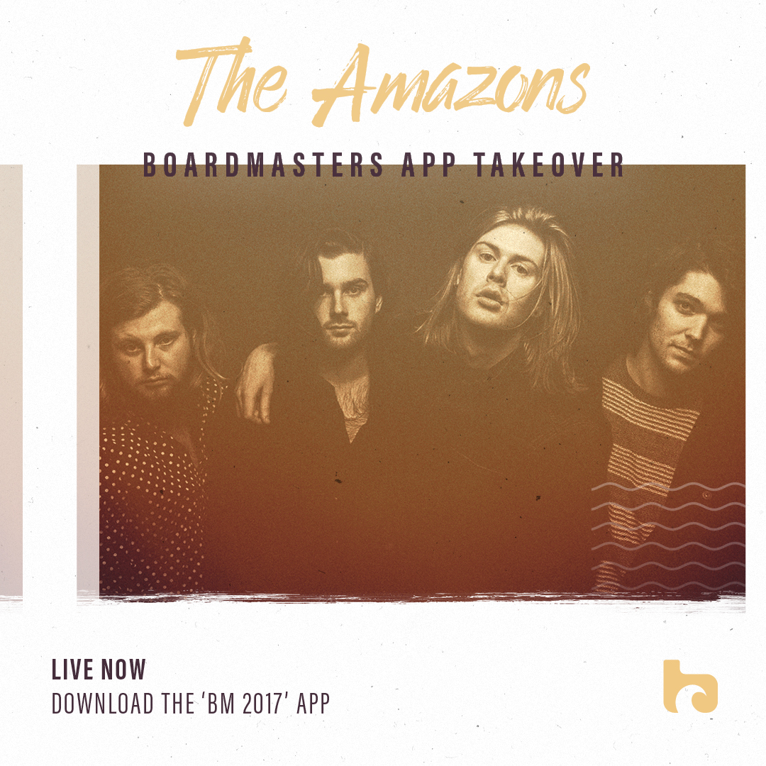
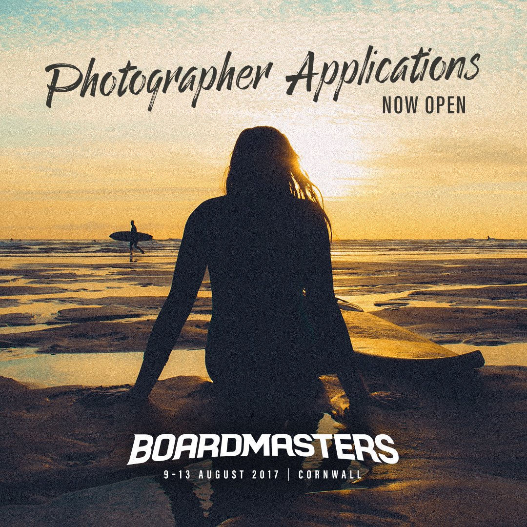
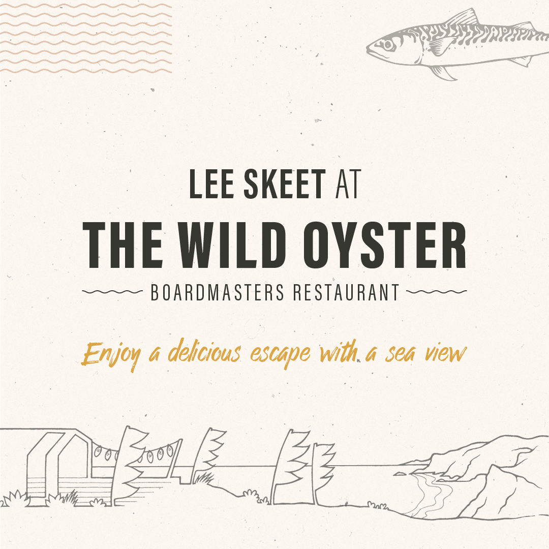
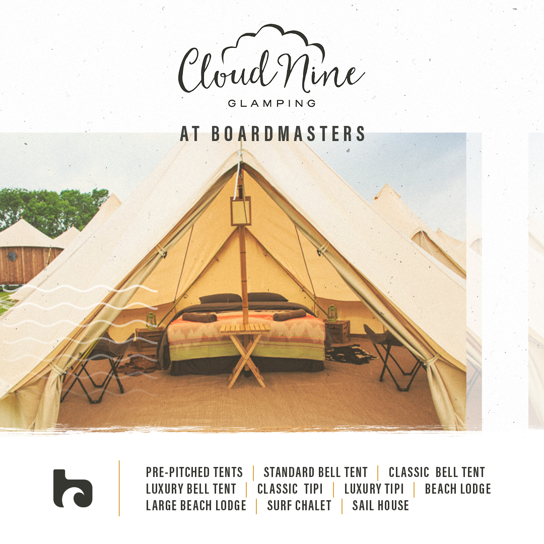
The lineup poster and website, both key marketing tools, were revisited. We updated assets, stripped out clutter and gave them both a more chilled out feeling. Social posts were made more consistent and flexible, with multiple templates allowing for varied on-brand messaging that is quick to produce.
Lineup Poster
2017 lineup poster
Brand Book
View brand book pages via the carousel slider below.
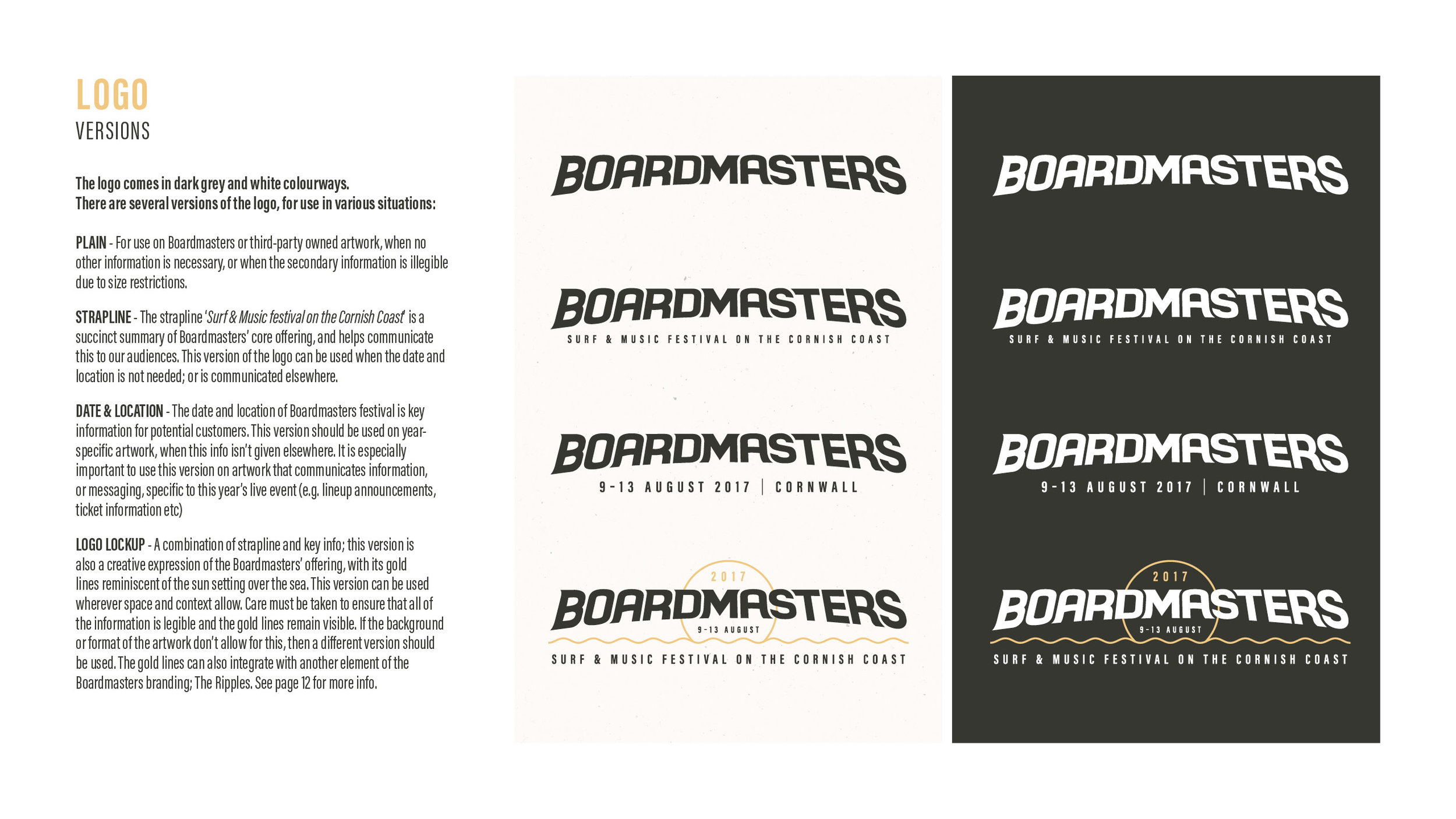
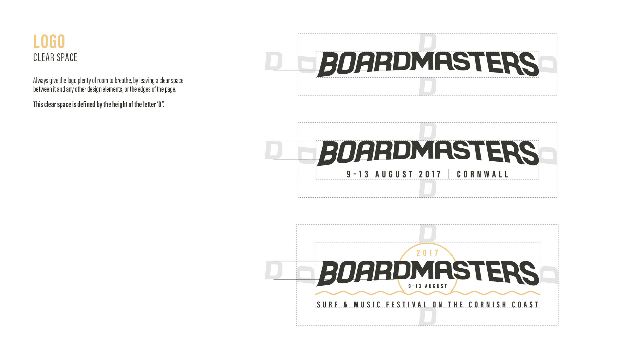
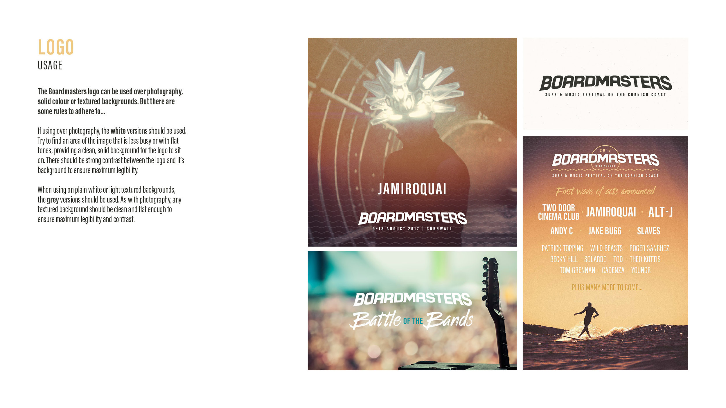
Brand Guidelines
View brand guidelines pages via the carousel slider below.
Website & Social Channels
Boardmasters website
Boardmasters Twitter Feed
Boardmasters Instagram Feed
Social Post Examples
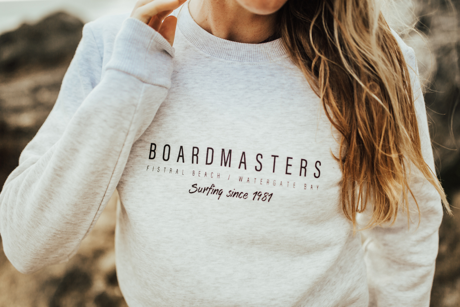
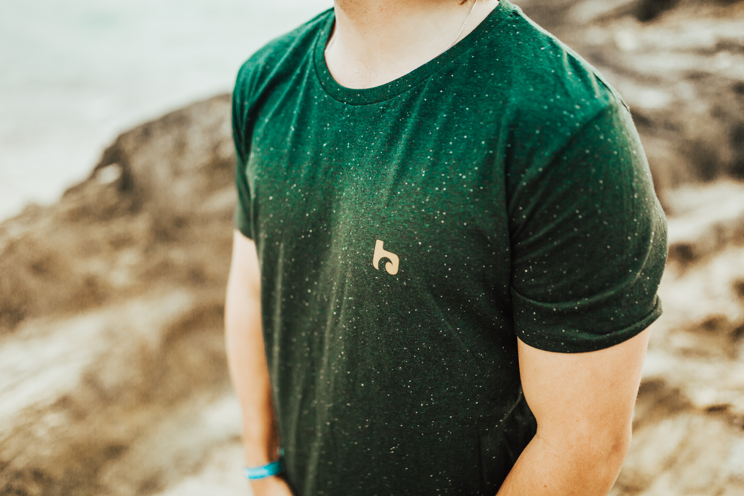
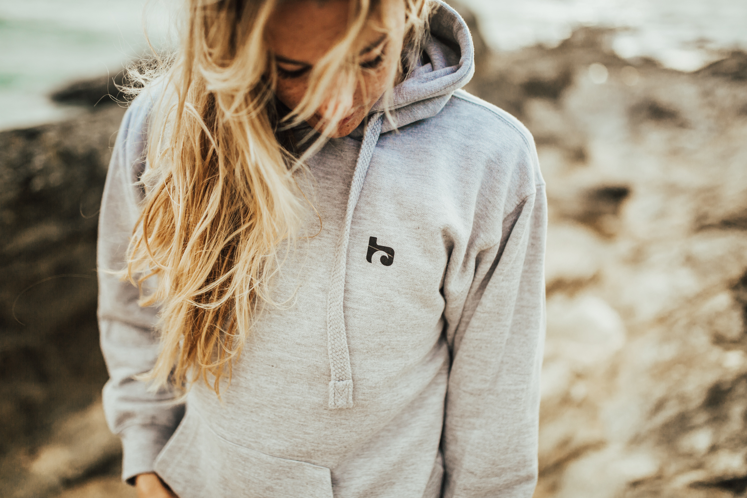
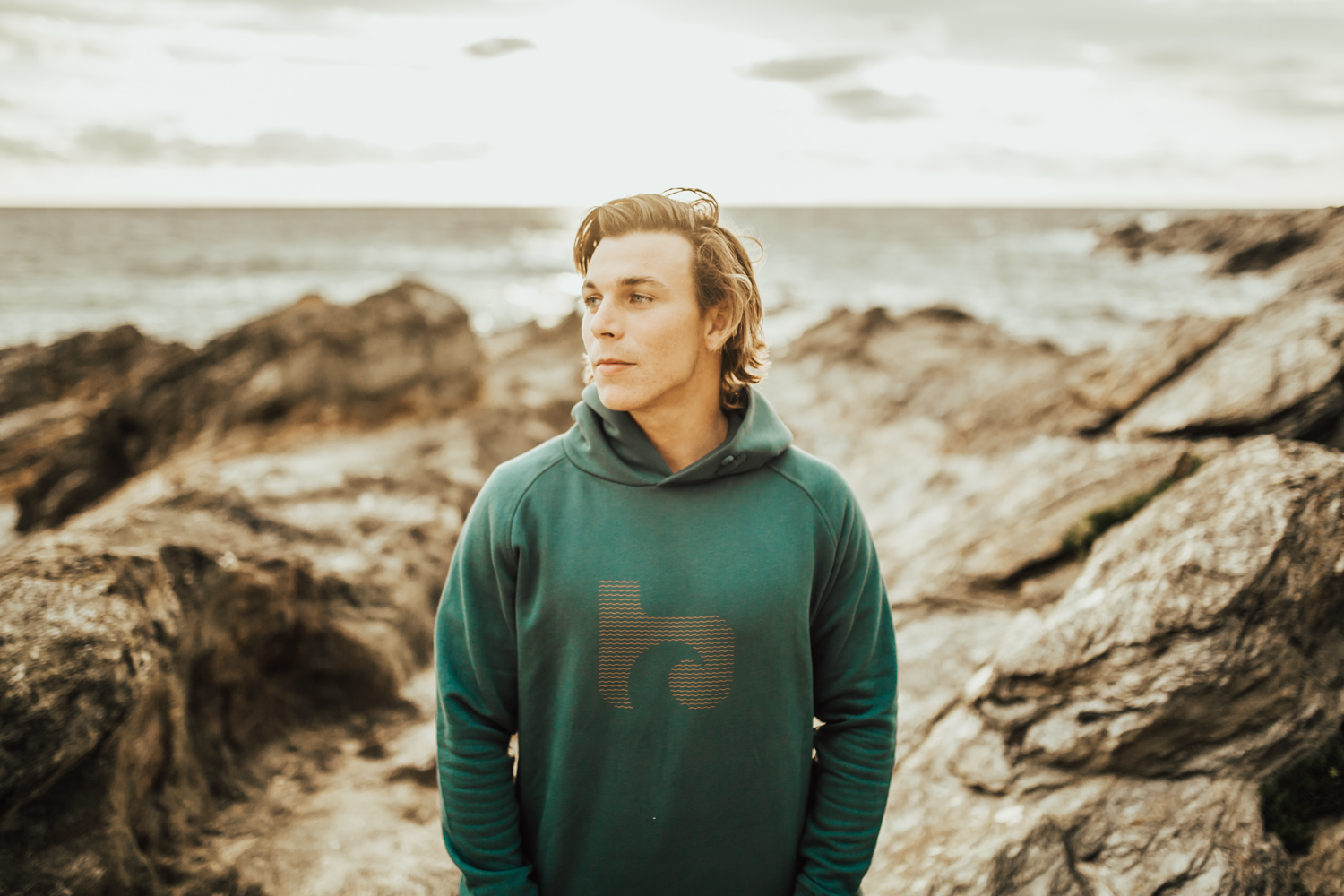
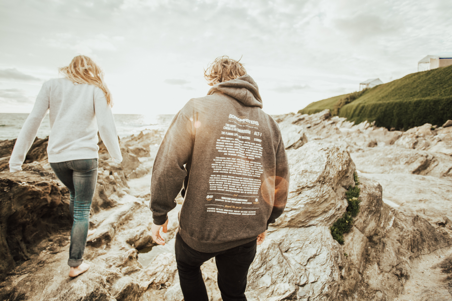
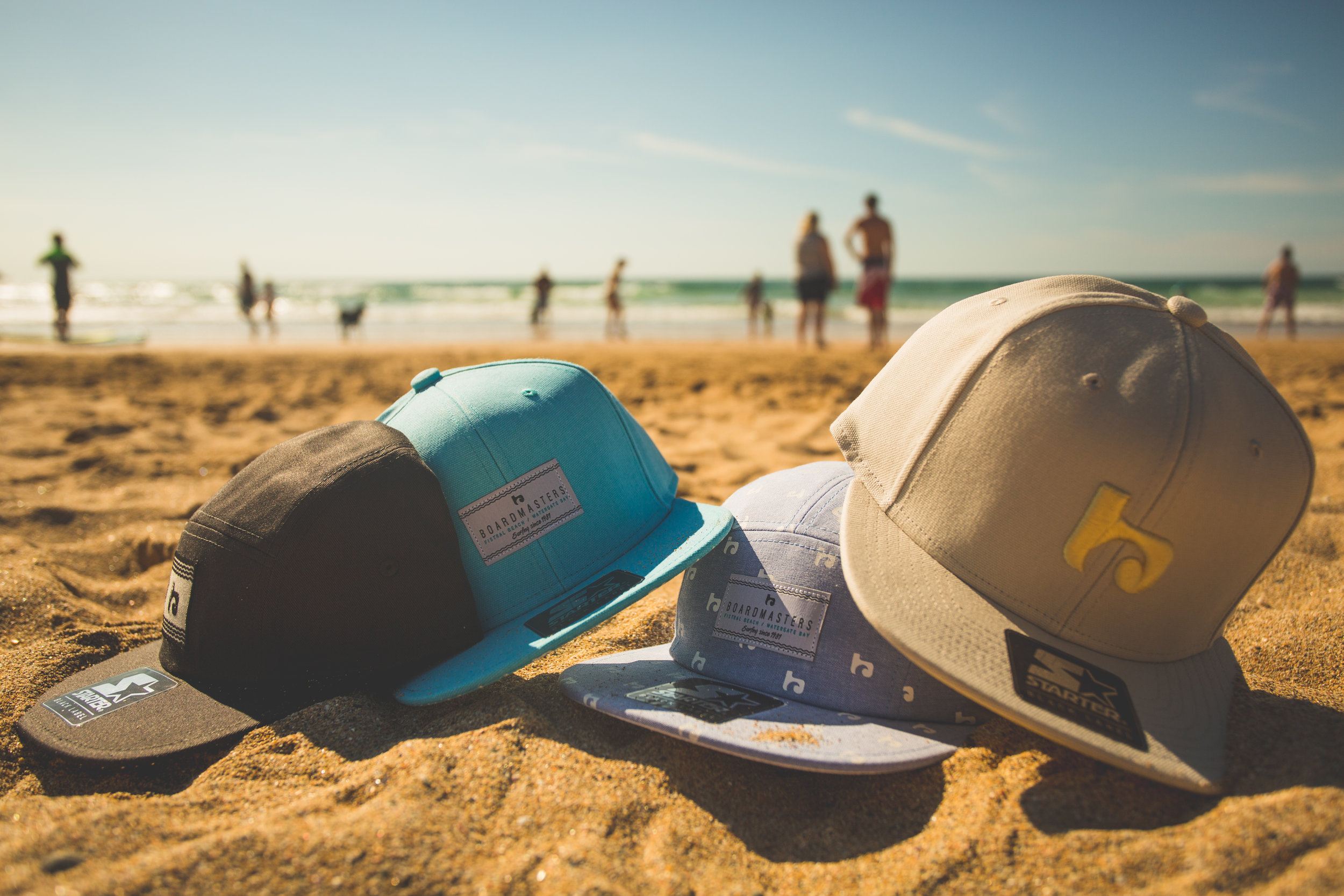
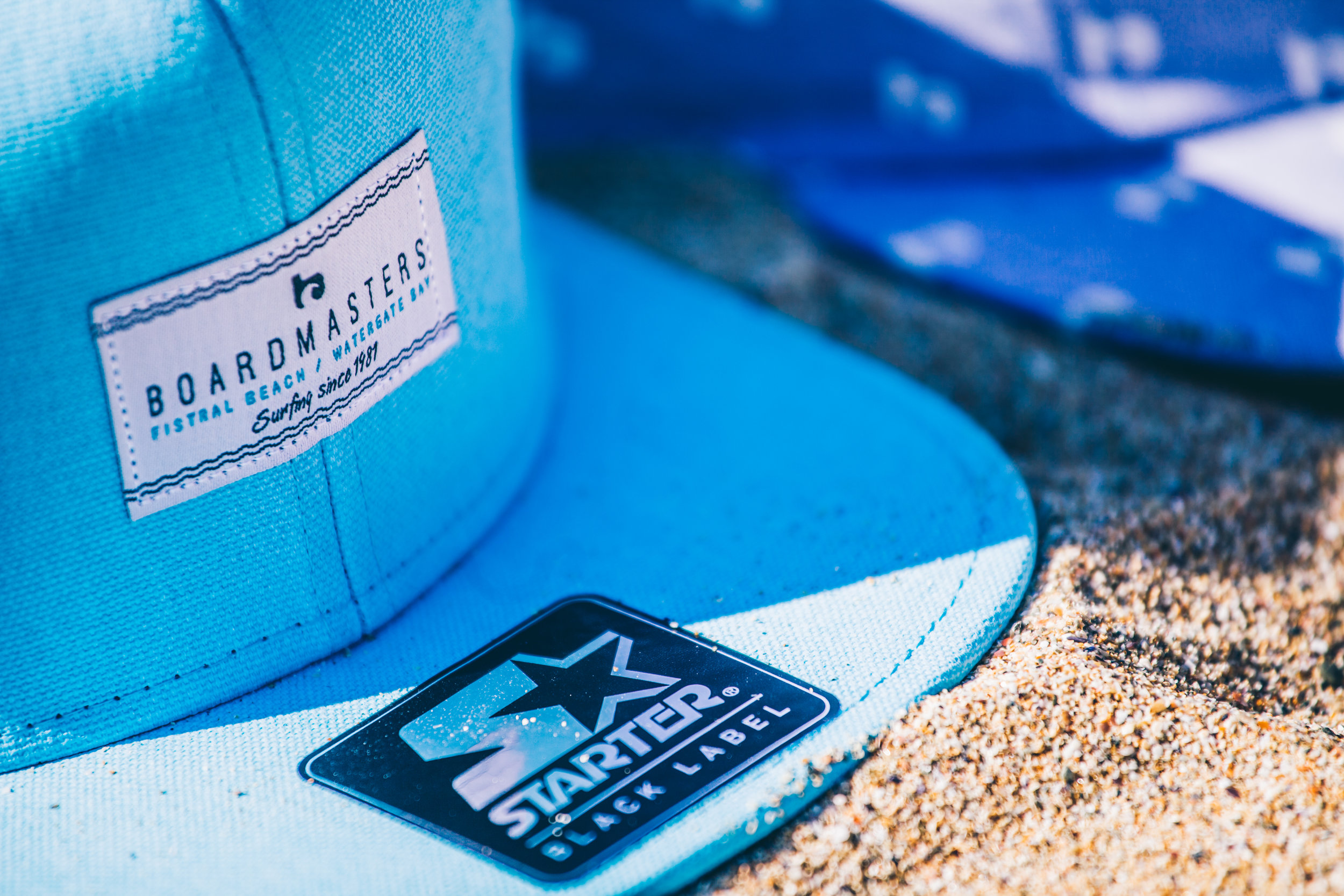
Merchandise
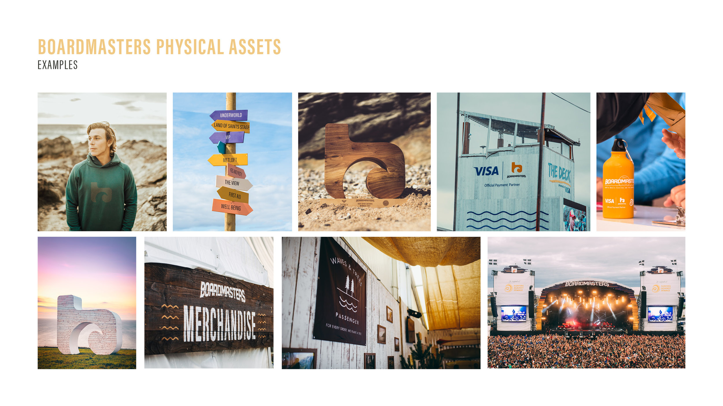
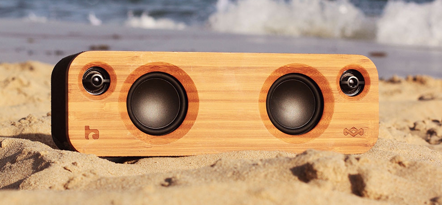
Brand roll-out examples
Stage branding
Boardmasters Festival App 2017 powered by Second Screen.
Branding continuing to After Dark: Boardmasters Official After Parties
Boardmasters Film
Onsite Assets
2017 Boardmasters main stage constructed from wooden slats and reflective copper strips.
The lovely Lianne La Havas showing how the Boardmasters palette is expressed through flags and wristbands.
B Icon sculpture - the perfect photo opportunity. Internal lights shine through at night, representing the water droplets of the 'wave'.
Surf Contest trophies by Lignum Surf. Hand-crafted and sourced from local sustainable materials.
Roxy Open winner Ella Williams shows off the trophy.
Festival programme and lanyard 2017
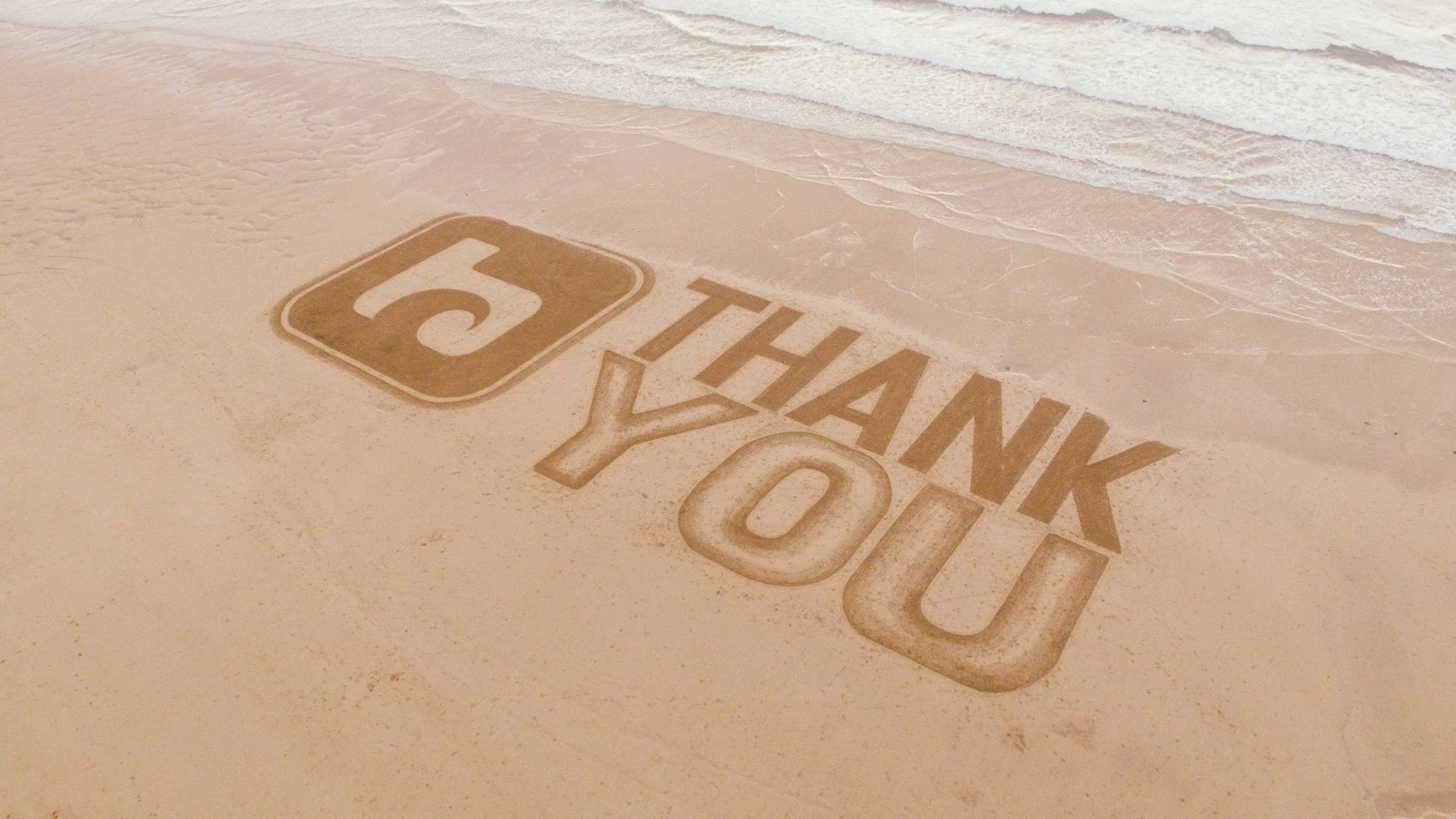
Sand art
Taking the brand further
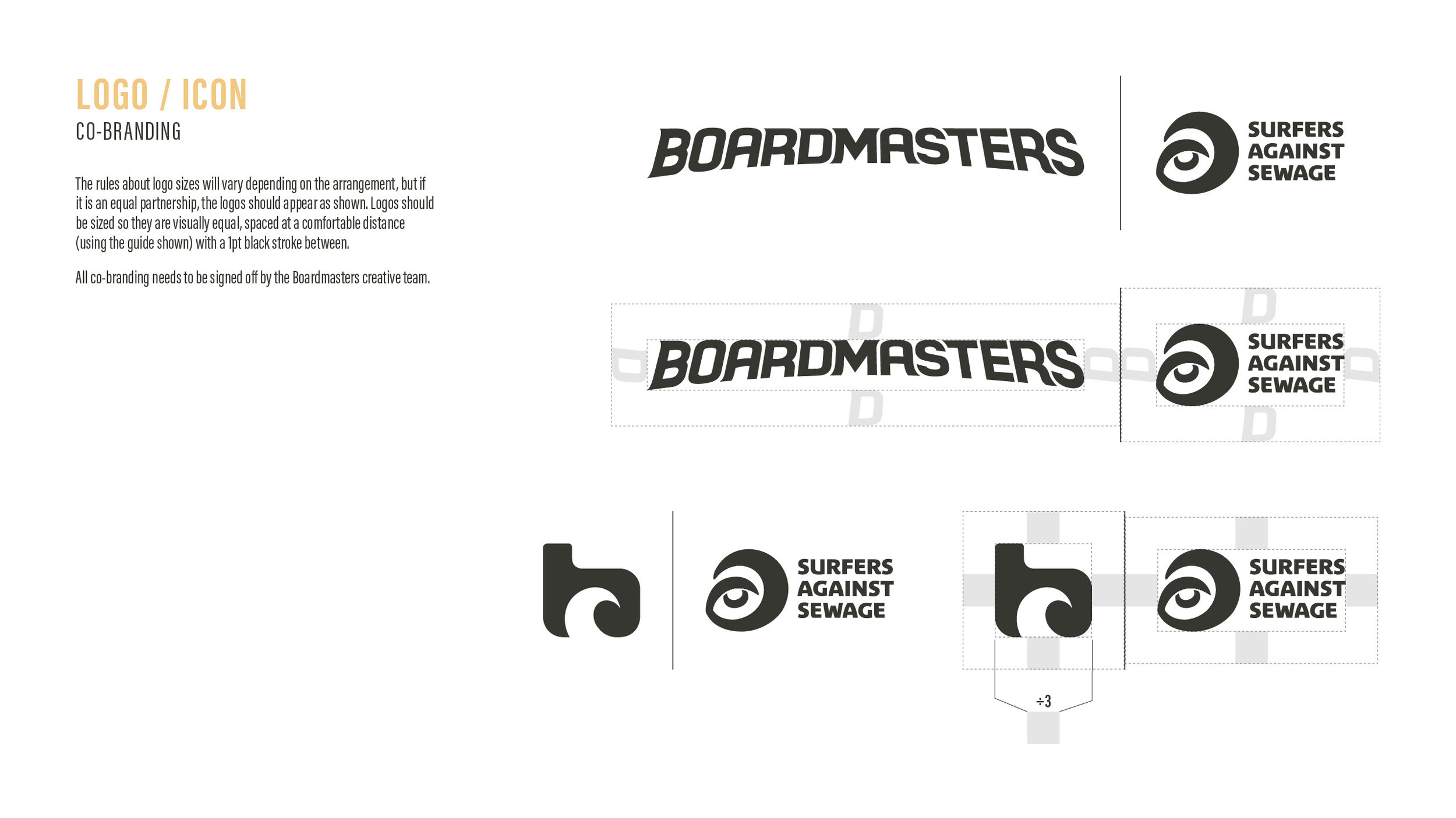
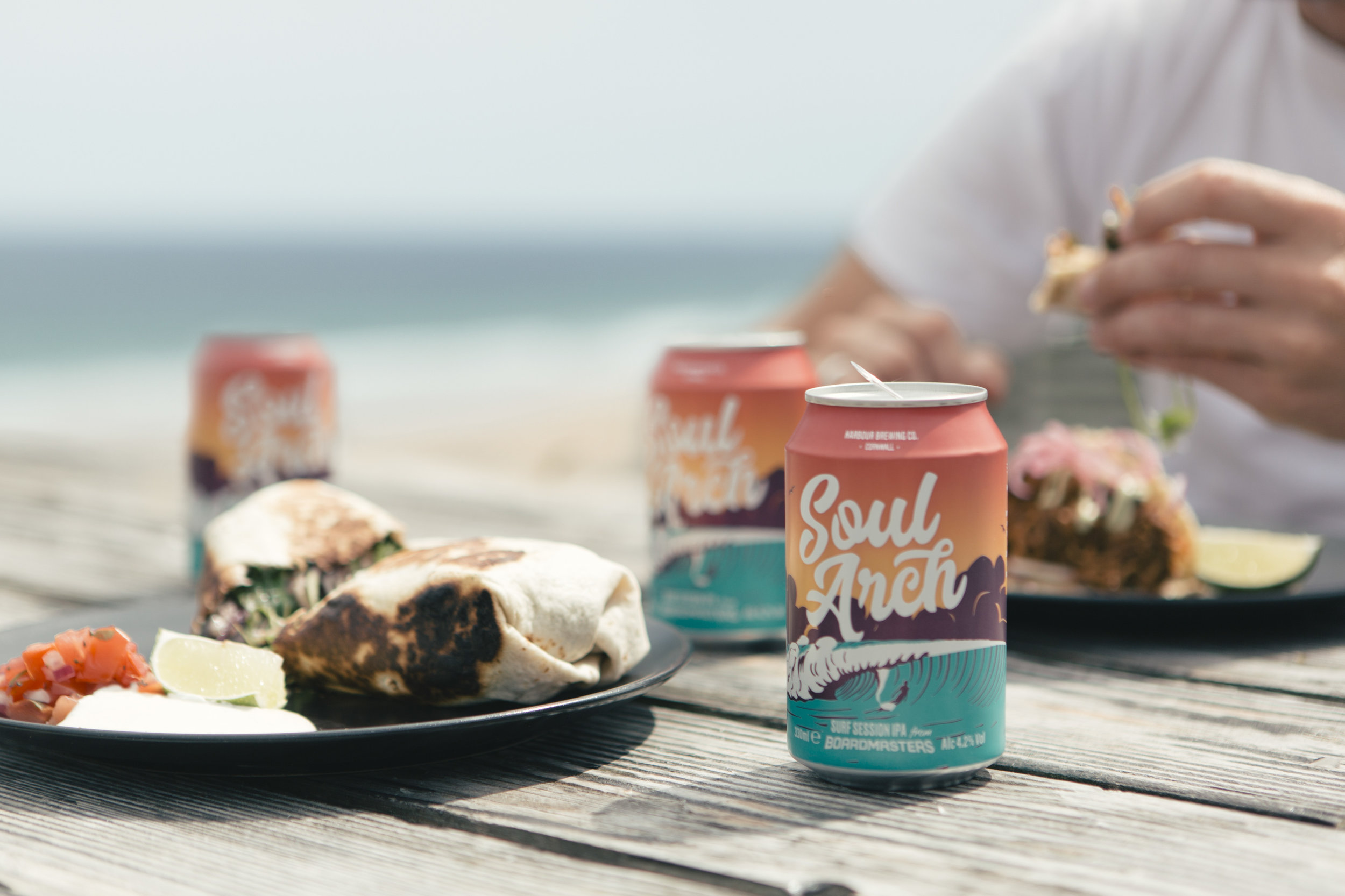
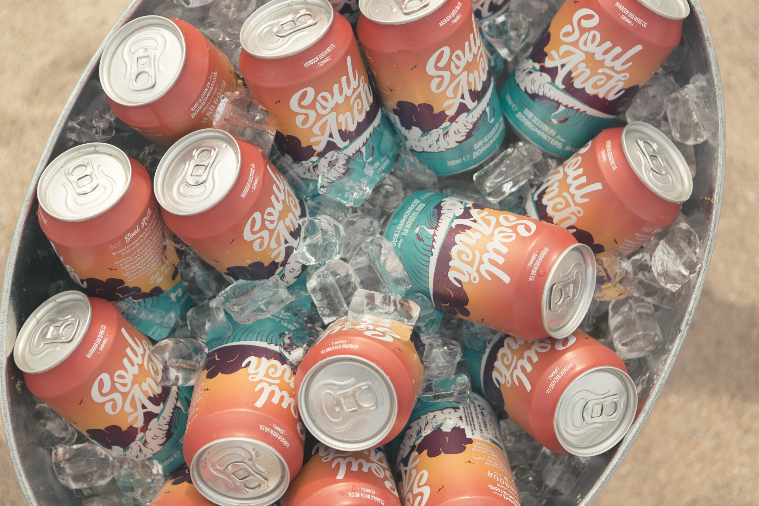
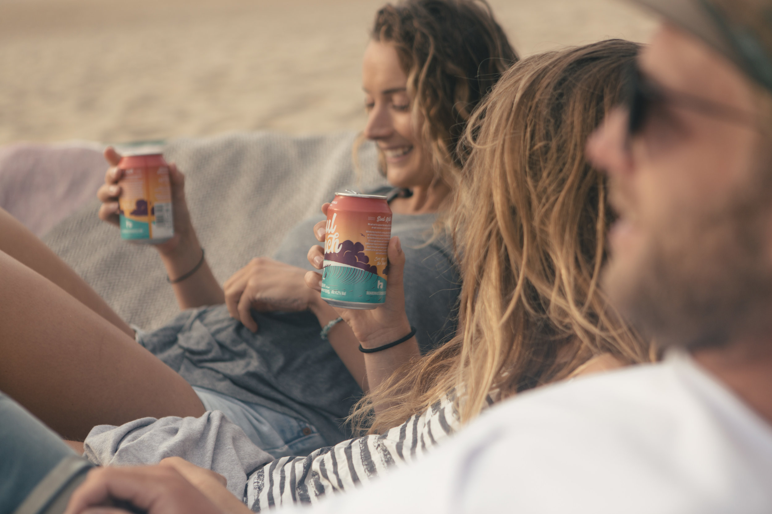
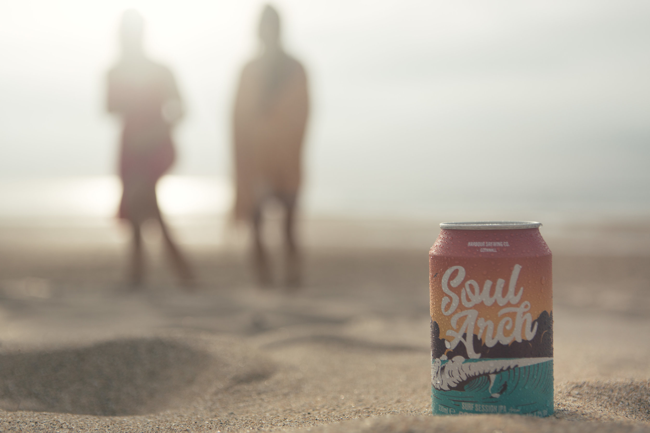
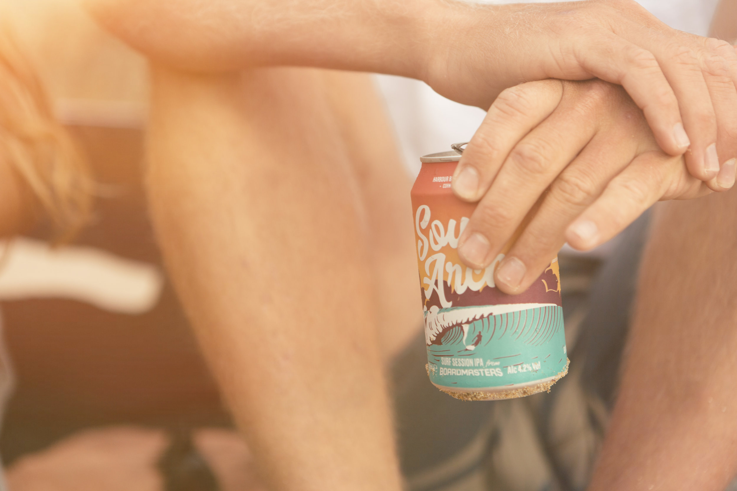
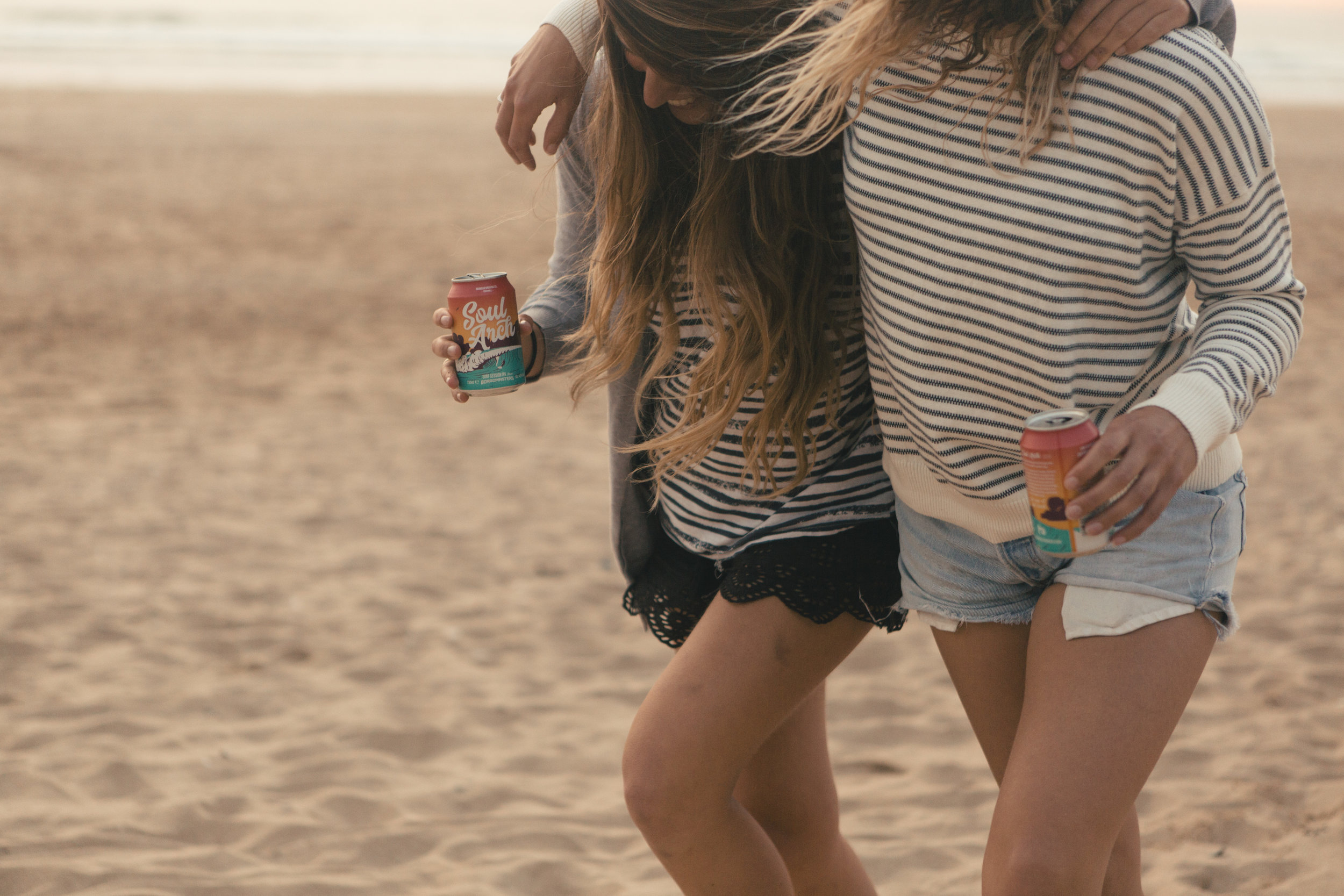
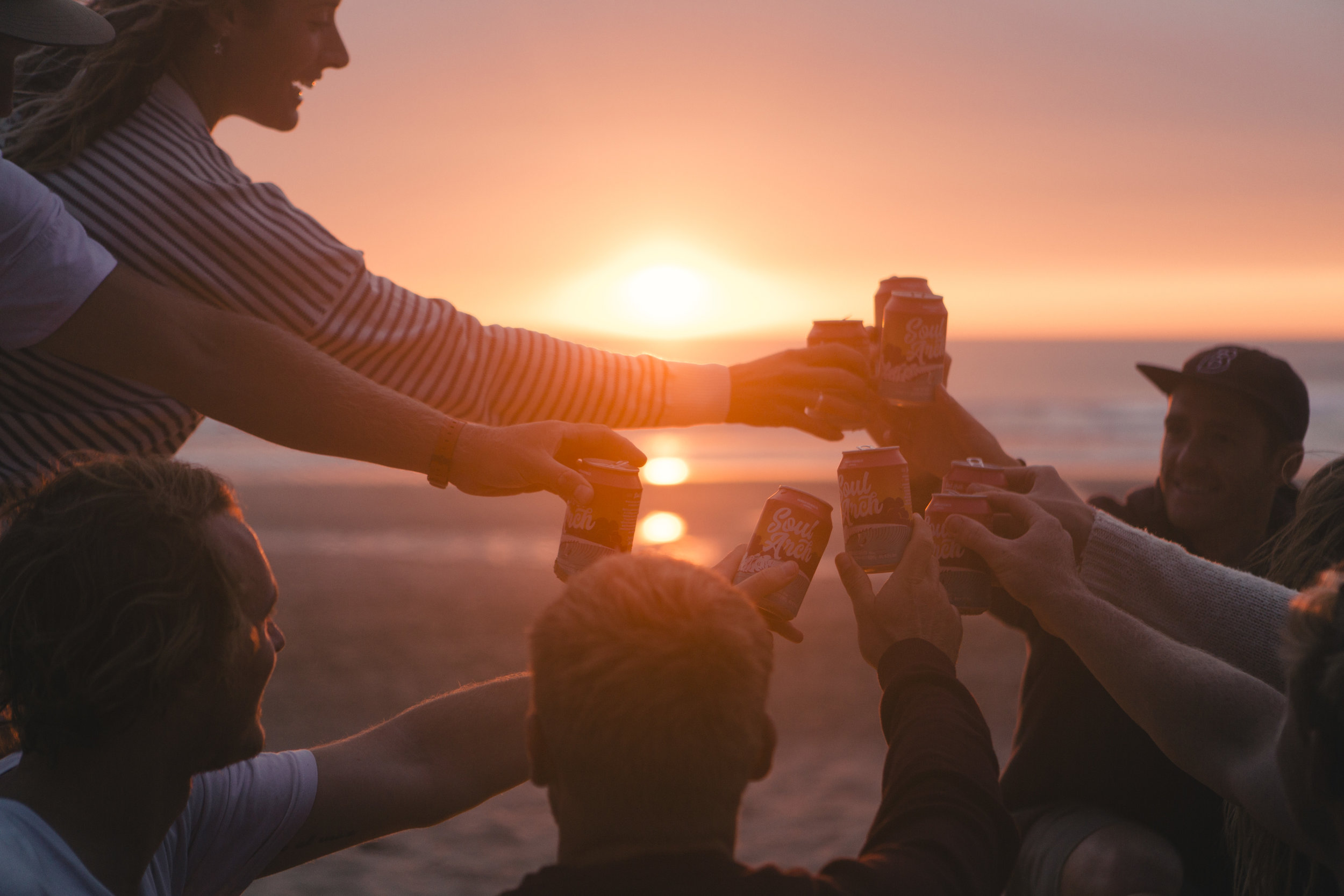
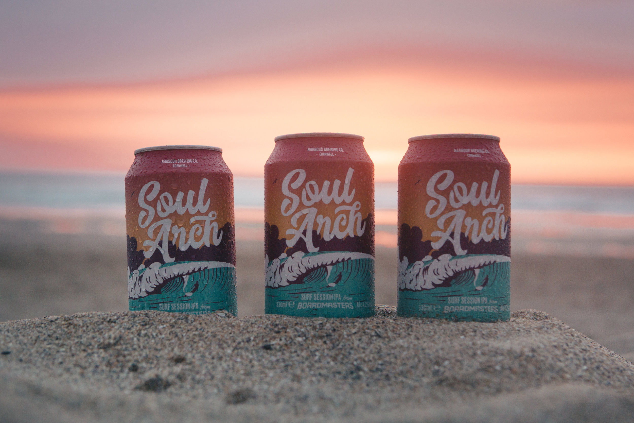
From beer to surf camps to charities, the Boardmasters brand is flexible enough to allow adaptation and alternate brand personalities, yet all still sitting under the wider Boardmasters brand umbrella.
Boardmasters Foundation - a charity to give back to the local Cornish community.


